
1. Acknowledgements
Basis Social would like to wholeheartedly thank the many people who contributed to this research project.
At the FSA, this includes Sophie Watson and Harriet Pickles in the Social Science team within the Analytics Unit for their advice on the research design and analysis, as well as Aimee Harmer, Robyn Smyth and Taryn Davey from the Food Policy Division for their policy advice.
Two external experts also contributed to the research design and analysis. Julie Barnett, Professor of Health Psychology at the University of Bath, is thanked for her guidance on consumer needs and behaviours regarding allergen communication when eating out. Rob Waller, an expert in information design, is thanked for his advice on the principles and practices for effective written communication.
Representatives from the following organisations are thanked for giving their time to attend the expert co-creation workshops:
-
Allergy Action
-
Allergy UK
-
Anaphylaxis UK
-
British Beer and Pub Association
-
Coeliac UK
-
Nationwide Caterers Association
-
UK Hospitality
-
University College London
-
University of Central Lancashire
-
University of Sheffield
Finally, a huge thanks to the many consumers with food hypersensitivities who contributed to the research, as well as the three food businesses who generously allowed us to test the prototype communication materials in their premises.
2. Executive Summary
Overview
In December 2023, the Food Standards Agency (FSA) commissioned Basis Social to conduct research to improve how Food Business Operators (FBO) use written communications to communicate about allergens to consumers with food hypersensitivity ((FHS)- allergies or intolerances to food or those who have coeliac disease).
The research had two aims, which were to provide:
-
evidence-based principles on the ways in which FBOs can improve the design and delivery of their written communications which 1) prompt consumers to disclose their allergies and intolerances and 2) provide allergen information to consumers.
-
evidence-based, user-tested designs of 1) a sign prompting consumers to disclose if they have a FHS[1] and 2) allergen information communication that could be used on written materials (including menus, labels and allergen matrices) to indicate which, if any, of the 14 regulated allergens are present.
The research employed an iterative approach inspired by design thinking. The logic of this approach was to start with FHS consumer needs, to develop principles for written communications that address those needs, and to understand what works for executing those principles in the context of signs, menus, labels and matrices. Methods used included an evidence review, co-creation workshops with FHS consumers and experts (including industry representatives, allergy charities, allergy experts, behavioural scientists), and digital and in-situ testing of prototype signs, menus, labels and matrices with FHS consumers.
This report presents the findings from the research. Key findings are summarised below.
1. Evidence-based principles on the ways in which FBOs can improve the design and delivery of their written communications
Written allergen communications must be responsive to three core FHS consumer needs: safety, confidence in the FBO’s ability to meet their FHS needs safely, and as close to normal eating out experience as possible. To meet these needs, the research identified two sets of principles.
Principles relating to written communications to encourage disclosure:
-
Salient– the communication is effective in getting FHS consumers to notice and pay attention to the message.
-
Clear– the communication provides a clear call to action, so consumers understand what is required of them.
-
Simple– the communication is concise, uses straightforward language and gets to the point.
-
Empathetic– the communication demonstrates that the FBO understands and will be able to meet FHS consumer needs (including safety, confidence and normality).
-
Motivating– the communication provides a reason for why it is important to disclose, or reduces barriers to motivation, for example by demonstrating that staff will react constructively and sensitively.
Principles relating to written communications indicating the presence of allergens in a dish:
-
Clear– the communication provides a clear indication of what allergens are present in dishes/products.
-
Easy to use– the communication makes it easy for FHS consumers to identify dishes/products that are safe for them to eat.
-
Comprehensive– the communication should indicate which of any of the 14 allergens are present, as opposed to just a subset.
-
Consistent– the communication uses a standardised system for communicating the presence of allergens. From an FHS consumers’ perspective, one universal system is preferable as it means they do not need to learn multiple systems. At the very least, an FBO should use the same system for all its communications.
-
Accurate– This is a property of how written information is checked and maintained, and so relates less to the execution of the information itself.
3. Design of a sign and written allergen information communication to indicate presence of allergens
The below findings reflect participants’ preferences, rather than what is measurably effective and which considers the needs of the FBO.
Sign encouraging consumer disclosure of FHS
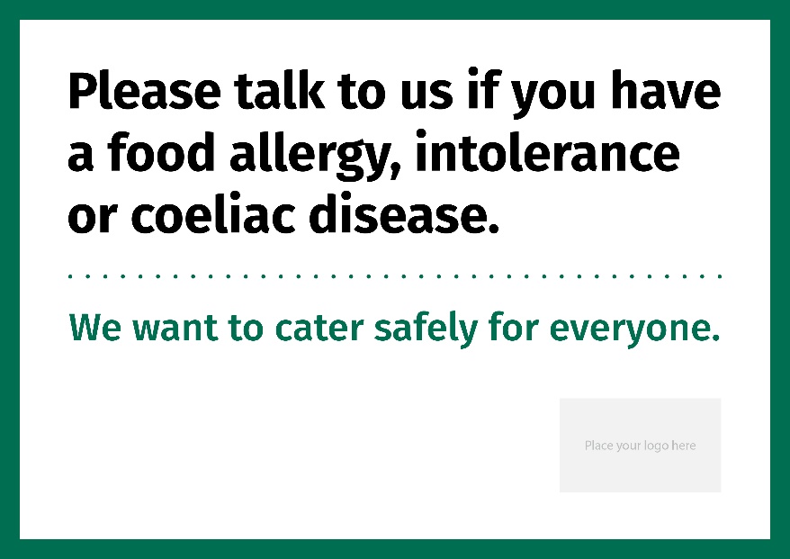
For signs encouraging disclosure, consumers’ most preferred message was:
- Please talk to us if you have a food allergy, intolerance or coeliac disease. We want to cater safely for everyone.
The message was simple and clear – both in terms of language and the need for FHS consumers to disclose. Additionally, consumers viewed the message ‘we want to cater safely for everyone’ as warm, inclusive, and empathetic.
The research suggested that additional messages highlighting the risks of relying solely on written allergen information can, in some instance, motivate FHS consumers to disclose their FHS. Based on this small-scale qualitative study, the two messages we tested were perceived as potentially effective:
-
Our menu descriptions do not contain all ingredients and we may sometimes have to substitute ingredients.
-
Our food is prepared in a kitchen where allergens are present.
However, there was a tension between the principle of motivation and simplicity. Some FHS consumers felt the additional text served to complicate disclosure messages, potentially reducing their effectiveness. Further research would be helpful to investigate whether an additional motivational message makes consumers more likely to disclose.
The timing of the message was also identified as a factor for behaviour change. FHS consumers said that messages seen at the moment when making a food choice (for example, when reviewing a menu) were more likely to prompt disclosure.
Logos were generally preferred to a plain sign. While consumers preferred the FSA’s logo overall, this was because it implied a FBO had been accredited. As this is not the case its use could lead to unintended consequences of misplaced confidence in the FBO. Using a business logo was interpreted as the FBO taking allergen communication seriously. Other ‘iconic’ graphic elements, for example a megaphone to signify the need for a consumer to talk and a heart to show a business caring, were tested and rejected in the ideation stage, as they distracted from the message.
Beyond a need for simplicity, FHS consumers did not discuss the graphic design of a sign in depth and how it could be made salient. Further research is recommended here.
Written allergen information communicating presence of allergens
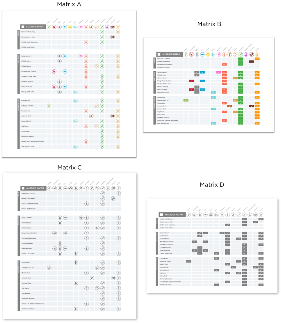
There were two main systems developed to communicate the presence of allergens in a dish: icons and emboldened text. Figure 1 shows the icons designs developed through the research. While both systems work, consumers had different preferences for which system is most clear and usable across different communication materials.
For menus, online and in-situ tests generated slightly different findings. Consumers taking part in online testing sessions preferred emboldened text. However, during the in-situ tests, consumers who used the systems to make food choices, said that both emboldened text and icons worked well in practice.
As a system for communicating allergen information, consumers saw emboldened text as clear and straightforward. Emboldened text also does not require consumers to use a legend or decipher the meaning of an icon, reducing cognitive load. However, during in-situ tests, consumers saw icons as having the advantage of enabling them to quickly scan the menu and find a dish that was safe to eat.
For labels used on signs to identify products, consumers preferred coloured icons with the accompanying text in bold underneath, with the only icons displayed corresponding to those present in a product. This execution was seen as clear and easy to use – mainly as the coloured icon was eye-catching and the allergen name was listed under each icon, reducing the risk of misinterpretation.
For matrices, consumers thought coloured icons worked better than ticks, as it was easier to read and identify the allergen, without needing to look back to the icon label at the top of the page. However, some FHS consumers also questioned whether icons would be universally recognised and understood by all FHS consumers, indicating risks of misinterpretation. If colour is removed, then ticks were perceived as easier to read.
Considering user-tested designs within the wider system
Effective written allergen communication enables FBOs to meet FHS consumer needs. However, signs, menus, labels and matrices are not a silver bullet. Rather, these communications materials should be understood as part of a wider system, all parts of which need to function effectively to meet FHS consumer needs. Based on this research, this system includes the need for:
-
FBO staff to have the capability (skills and knowledge) and opportunity (time) to effectively communicate with FHS customers, and to be motivated by beliefs to take FHS seriously and knowledge about the allergens present in a dish.
-
FBOs to put in place processes and systems for allergen management and communication.
-
FBOs to provide additional information on allergen management practices to consumers, for example a website.
Verbal allergen communication also forms a key part of the wider system. Although the principles developed in this study relate primarily to written communication, several may reasonably be applied to verbal communication. For example, verbal communications are likely to benefit from being clear, simple, empathetic, motivating, accurate, comprehensive and consistent. However, verbal communication comprises additional elements (for example, body language) that have not been considered in this research. Consequently, this research does not provide guidance on how to execute these principles for verbal communication. Further research may be useful for exploring how this should be achieved verbally, and if any other principles are warranted for verbal communication of allergen information.
This research was led primarily by FHS consumer needs. While industry experts and FBOs did participate at key stages, it would be valuable to explore the useability and feasibility of the designs with FBOs in more depth. For example, recruiting FBOs for in-situ testing was a significant challenge. This was due primarily to the difficulty finding FBOs whose existing written communication materials (in particular, menus) could be adapted easily and quickly to reflect the prototype designs.
Several FBOs were unable to participate in in-situ testing because of difficulties updating their existing written allergen information to reflect the prototypes. This included FBOs whose menus were very complex or contained incomplete allergen information. While the total number of FBOs approached for this research was small, the difficulties experienced for recruitment to test the materials in situ are revealing. They underscore the range of ways in which FBOs may struggle to adapt to a more standardised approach to communicate allergen information through written communications. Consequently, the research recommends further work to explore the feasibility of the user-tested designs with FBOs.
3. Introduction and background
Food hypersensitivity (FHS) includes food allergy, intolerance, and coeliac disease and affects over 3% of people in the UK.[2] It is a significant health issue that has extensive impacts on quality of life and mental health, causing stress, depression, and anxiety.[3] [4] Food allergies can also lead to hospitalisation - there were over 30,000 hospital admissions related to a food induced anaphylaxis between 1998-2018, with an annual increase of 5.7%. However, the percentage of fatalities has decreased from 0.7% to 0.19% over the same period.[5]
The Food Standards Agency (FSA) is responsible for allergen labelling and is seeking to make improvements to help people with FHS make safe, informed decisions when purchasing non-prepacked food. This is food which is sold loose, or which is packed or cooked and served to order, for example, takeaway food and food served in restaurants and cafés.
Currently, if a Food Business Operator (FBO) sells or provides food to customers directly, for example in a restaurant, they must provide allergen information. This can be done in a number of ways including:
-
written allergen information such as on a menu, chalkboard or in an information pack such as an allergen matrix.
-
Verbally with a written notice placed in a clearly visible position explaining how customers can obtain this information - for example by speaking to a member of staff.
Regulations[6] impose a duty on FBOs to ensure that all mandatory food allergen information (relating to 14 substances listed in the Food Information to Consumers Regulation that are known to cause allergies) is accurate, available, and easily accessible to the consumer. To enable this, FBOs need to have the skills and knowledge to provide accurate allergen information and manage allergens effectively.
Research conducted for the FSA on the needs and preferences of FHS consumers when eating out, as well as with FBOs on allergen management and communication practices, has highlighted that while both parties want eating out or buying takeaway food to be a safe and positive experience for FHS consumers, there are differing views as how best to achieve this.[7]
For example, some FHS consumers are keen to have a ‘normal’ dining experience and make decisions about the food they eat by relying on written information, with minimal necessity to initiate a conversation with staff. Meanwhile, some FBOs want to work with customers to find the right options for them, which requires a conversation, so food can be prepared safely and any risk of allergen cross contamination managed.
The FSA are keen to encourage consumers to inform staff that they have a FHS requirement and make them feel comfortable asking for allergen information. Additionally, the allergen information provided to consumers needs to be clear, easy and accessible so they can make an informed choice when deciding what to eat.
This research focused on in-person experiences of FHS consumers ordering loose food at micro, small and medium sized (SME) food business’.
The aims of this research are to provide:
-
evidence-based principles on the ways in which FBOs can improve the design and delivery of their written communications which 1) prompt consumers to disclose their allergies and 2) provide allergen information to consumers.
-
evidence-based, user-tested designs of: 1) a sign prompting consumers to disclose if they have a FHS and 2) allergen information communication that could be used on written materials (e.g. menus, labels) to indicate which, if any, of the 14 regulated allergens are present.
To help meet these aims, the following research questions were identified.
-
What do consumers need from communications during different types of interaction or points of contact with a food business?[8]
-
What is and isn’t working for the current methods of communication (written and verbal) at each touchpoint (including message, design, delivery, timing in consumer journey, placement), considering consumer needs?
-
What does previous research and theory (e.g. behavioural, communications, design) recommend for effective communication?
-
What are the ways in which FBOs can improve the design and delivery of their communications on allergen information to consumers when they are eating out, to ensure that they are effective and meet the needs of consumers?
4. Methodology
Overview of approach
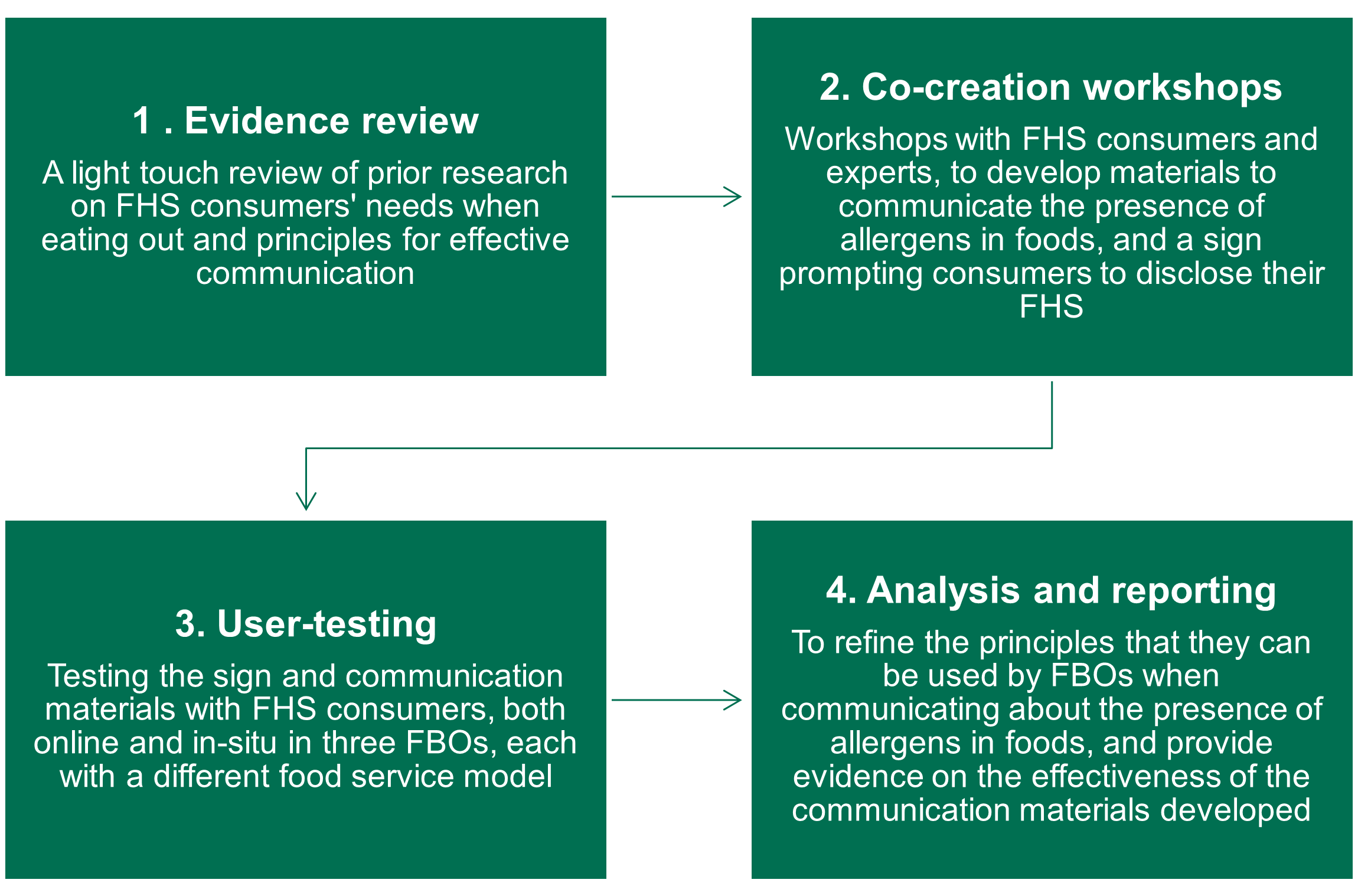
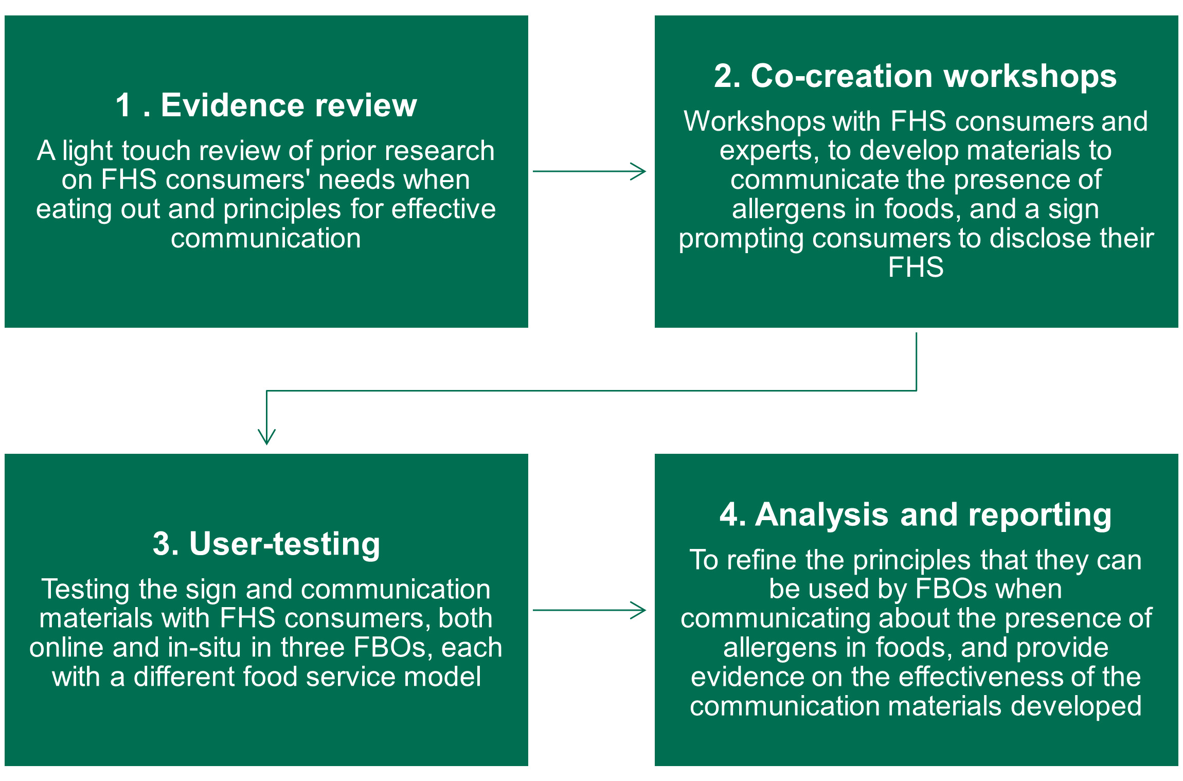
The overall approach for the research was inspired by design thinking,[9] an iterative and human-centred method used in this context to understand the needs of FHS consumers, identify problems in current allergen communication and create innovative communication materials to prototype and test. The method involved four stages, shown in Figure 2.
Communication principles were developed across each research stage. The principles were initially presented as a working list and refined as consumers discussed how they used different assets (for example, signs and menus) in practice. Specifically, the four types of communication material considered were:
-
Signs requesting consumers to disclose their FHS
-
Menus
-
Labels
-
Allergen matrices
While the research design involved industry trade bodies in workshops and some FBO interviews, overall, the research was consumer-led. Further work is needed to understand whether these materials are workable for FBOs.
Finally, it should be noted that the approach was iterative and involved the team learning and adapting the methods as challenges emerged. The limitation of the methods, as well as challenges faced are discussed in greater depth below.
A summary of each stage is now provided. For full methodological details of each stage, please refer to the technical report.
Stage 1: Evidence review
The first stage of the research involved a review of published evidence and internal FSA work related to allergen communication and the needs of FHS consumers when eating out. The review also conducted a light touch analysis of effective communication practice, with a focus on insights from the behavioural sciences. In total, 32 documents were analysed, mainly centred on prior research undertaken for the FSA (see Appendix A).
The aim of the evidence review was to provide:
-
A draft set of principles concerning the effective design and delivery of FBO written allergen communications, to be iterated through primary research.
-
The allergen communication needs and challenges faced by FHS consumers and FBOs, using a customer journey map of eating out.
-
Personas to bring to life these needs for different FHS consumers and FBOs.
The outputs from the evidence review were used as stimulus to inform the co-creation process. The customer journey map and personas are provided in Appendix B.
Stage 2: Co-creation workshops
Introduction
The co-creation workshops aimed to develop ideas and prototype communication materials against the principles of food allergen communication identified through the evidence review.
The co-creation process involved two sub-stages.
-
Stage 2A involved developing ideas to prototype the following communication materials:
-
A sign, prompting consumers to disclose if they have a FHS
-
Allergen information communication that could be used on written materials (e.g. menus/ labels/matrices) to indicate which, if any, of the 14 regulated allergens are present.
-
-
Stage 2B involved refining the prototype communication materials.
Each stage had two workshops: one with 14 experts (including industry representatives, allergy charities, allergy experts, behavioural scientists) and one with 13 consumers who have FHS (selected to cover a range of FHS types and severities as well as demographic characteristics) – see Table 1 for a breakdown. Additionally, 4 designers attended each workshop to support the creation process. Sample details are provided in Appendix C.
Each stage is now discussed in more depth.
Stage 2A: Developing ideas for communication materials
The first workshops were held face-to-face and generated ideas for the communication materials. The expert workshop took place on the 18th January 2024 and the consumer workshop on the 20th January 2024. Each workshop lasted 3 hours.
The workshops aimed to immerse participants in the topic area and the communication needs of FHS consumers and FBOs when eating out. Participants were presented with a range of information which they were asked to discuss and comment on. This included:
-
a FHS customer journey when eating out, based on previous research
-
the needs of FHS consumers and FBOs as expressed through personas
-
real-life examples of:
-
menus, labels and matrices with allergen information on them
-
allergen disclosure signs
-
Participants were also presented with a working list of principles for effective allergen communication. Participants were asked to use these principles, and consider the needs of FHS consumers and FBOs, during an adapted version of the ideation exercise called “Crazy 8s”. For this exercise, participants were asked to sketch four distinct ideas in eight minutes, in response to a specific challenge (for example, how to communicate allergen information to consumers). The activity was designed to produce as many ideas as possible, rather than focus on the quality of ideas. Participants then prioritised ideas at the end of the workshop.
The ideas generated through the crazy 8s exercise and through wider workshop discussions were used to identify broad themes for what was important to participants. Prototypes of signage, menus, matrices and label options (see Appendix D) were then designed with these needs in mind.
Stage 2B: Refining the prototype communication materials
The second workshops were held online and aimed to gather insight on how to further develop and refine the prototype communication materials. The expert workshop took place on the 6th February 2024 and the consumer workshop on the 7th February 2024. Both workshops lasted 2 hours.
Workshop participants were presented with a variety of executions of different communication materials (see Table 2). Participants were asked about their immediate reactions to each execution, before reviewing them in greater depth in terms of the extent to which they met the principles for allergen communication.
Appendix D includes an image of all the prototypes tested in the online workshops.
Developing the final prototypes for testing
Following the workshops, a thematic analysis was conducted to identify the principles of effective communication arising from the evidence review and co-creation sessions. The prototypes that were preferred by workshop participants were optimised considering the principles and participants’ feedback from the session. A final set of prototypes was taken forward for user testing (see Appendix E).
Stage 3: User testing
Introduction
User testing aimed to explore FHS consumer views about how easy different prototypes were to use, and which prototypes they preferred. The prototypes tested are shown in Appendix E. An overview of these prototypes in provided in Table 3, below.
User testing comprised two sub-stages.
-
Stage 3A involved testing the prototypes on a digital platform with 33 FHS consumers.
-
Stage 3B involved testing the prototypes live in 3 food business settings with 18 FHS consumers.
-
The food businesses were selected to have different service models, as follows:
-
A restaurant with table service
-
A café with counter service
-
A market stall
-
-
Interviews with the FBOs were also conducted to understand their experience of using the prototypes.
Stage 3A: Digital testing
The aim of the digital testing was to undertake a detailed exploration of FHS consumers preferences on the communication prototypes. This included:
-
Consumers’ immediate reactions, thoughts and feelings to each communications prototype
-
How easy consumers thought it would be to use the communication prototypes
-
How consumers viewed and would improve the disclosure messages on the communications prototypes, including their likelihood to disclose their FHS
-
How consumers viewed, and would improve, the design features on the communications prototypes, including the use of logos, icons, or written allergens
Note that as these questions were explored online, responses reflect participant’s beliefs about how they would behave and what would be useful. They do not provide insight into how participants would actually behave if presented with the prototypes during a real-life eating out experience.
Digital testing was undertaken using an online engagement platform (Howspace). Testing took place between 27th February and 5th March and involved 33 consumers with a range of FHS (including different food allergies, intolerances and coeliac disease), of varying severities, and with different demographic characteristics (see Appendix F for sample details and Table 4 for a breakdown). Each participant completed a total of three tasks, the first two lasting 25 minutes each, and the third lasting 10 minutes.
Consumers were divided into four groups of approximately equal size. Consumers in each group were shown example prototypes and then asked a series of questions about them. Private responses were collected, and there was no group discussion concerning the prototypes. Given the number of prototypes developed, different prototypes were shown to each group (see Table 5 below and refer to Appendices D and E for prototype executions). The digital testing discussion guide is provided in the Technical Report.
Tasks undertaken by FHS consumers during the testing included:
-
Using the platform annotation tools to mark up the communication materials to indicate what design features they liked or did not like.
-
Open text questions, for example asking consumers why they thought prototypes were effective/ineffective, what they liked/disliked about different design features, and how to improve message wording on disclosure signs.
-
Asking participants to describe step by step how they would use prototypes.
-
Responding to hypothetical scenarios, for example showing images of different eating out settings (e.g. a restaurant, café and market stall) and considering how communication prototypes might work in each setting.
-
Using a survey function to vote on their preferred executions of a prototype (e.g. the ease of use of menus designed using emboldened text versus icons).
Alongside the main prototypes (signs, menus, labels and matrices) developed and tested through this research, the digital testing stage also gathered participants’ responses to ideas for digital communications. These ideas focused on menus and matrices that used a filtering system so that FHS consumers could exclude unsafe options.
Stage 3B: In-situ testing
The aim of the in-situ testing was to explore how FHS consumers respond to and use the prototype communication materials (a sign, a label and a menu) when ordering food at a food business. This included:
-
Whether consumers noticed the allergen disclosure sign.
-
Where noticed, whether the sign encouraged a consumer to disclose their FHS requirements.
-
How easy consumers found using labels or menus with either emboldened text or icons to indicate the presence of allergens in a dish.
-
How environmental factors influenced the use of the allergen communication materials (for example, busyness of the food business, the role of waiting staff, differences in food service model).
-
How FHS consumers believed the communication materials could be improved, accounting for these environmental factors.
In-situ testing was undertaken in 3 food business settings, each with a different food service model:
-
A restaurant using table service. The main prototypes tested at the restaurant included a menu that used icons and a disclosure sign.
-
A café using counter service. The main prototypes tested at the café included a menu and food labels, both of which used emboldened text, and a disclosure sign.
-
A market stall. The main prototypes tested at the market stall were food labels that used icons and a disclosure sign.
As part of these interviews, participants were shown the other prototypes that had been developed and asked to compare them to the prototypes they had seen and used during the in-situ tests.
Table 6 provides an overview of what prototypes were tested in each setting. For each food business, their existing labels and/or menus were re-designed with either icons or emboldened text along with a disclosure notice. In all other respects, the re-designed materials were made to look like the FBO’s current menu or label design.[10] A different FHS disclosure sign was also tested in each food business, using the prototype designs created during the co-creation session. Only the market stall currently used a disclosure sign.
In total, 18 FHS consumers took part in the in-situ testing (6 per food business). FHS consumers were recruited to a range of demographic characteristics. However, to minimise safety risks, only consumers with a mild or moderate FHS were involved in the in-situ tests (and those with severe food allergies or coeliac disease were excluded). Sample details are provided in Table 7 below.
The in-situ testing involved accompanied consumer observations and interviews. Specifically, researchers either ate a meal with FHS consumers in the restaurant or café or accompanied them buying products from the market stall.
To minimise the influence of the research design on behaviours, FHS consumers were initially not made aware that the purpose of the research was to test prototypes of communication materials; rather they were told the research team were interested in observing their experiences of eating out. After food was ordered and provided, researchers explained that the purpose of the research was to test prototype communication materials.
During the in-situ tests, interviews were conducted using a semi-structured discussion guide. These guides were adapted for each FBO, based on their service model and prototypes tested.
As well as using their redesigned menu or label prototypes to serve participating FHS consumers, FBOs were encouraged (but not required) to use the prototypes as part of the regular service with other consumers, so long as they were comfortable doing so. This was adopted in the café and the market stall. However, this was not possible in the restaurant, due to a last-minute replacement a dish on the menu.[11] FBO’s also took part in a follow-up interview to get their feedback on using the prototypes.
As far as possible, FBOs were asked to replicate their normal service process when using the prototypes. No guidance about how the prototypes should be used was provided. FBOs were free to place the disclosure sign where they felt best, and to use written communication prototypes (labels and menus) in line with their standard practice. The only additional request was for FBOs to give participating consumers the opportunity to disclose their FHS themselves, without being verbally prompted. This was to avoid participants being prompted to disclose before they had the chance to respond to the prototypes. If participants had not disclosed their FHS, servers were free to engage in any verbal allergen communication that they usually would. As a safety precaution, FBOs and service staff were made aware in advance that the consumers accompanying the researcher had an FHS.
Stage 4: Analysis and reporting
Each stage of the research involved a different analytical process. These are summarised in Table 8 below. Full details of the analysis process can be found in the technical report.
The final report draws together and integrates findings across each of the stages, with a focus on the following two areas.
The first concerns principles of effective communication. As mentioned, a working list of principles was developed from the evidence review. This list was refined following the co-creation workshops. During the user testing stage, the list was further simplified and refined in terms of how written communications are used in practice, and which principles matter most to FHS consumers in this context.
The second concerns views on the use and effectiveness of the written communications materials. Analysis for this part of the report predominantly focuses on the user testing stages, though findings from co-creation workshops are included – for example, to provide insight into why early-stage prototypes were rejected.
Methodological limitations and learnings
The research method had several limitations, as well as learnings that arose through the research process. These are summarised below, and further thoughts on implications are provided in Chapter 7.
Evidence review stage
There was little published evidence on the effectiveness of written and verbal allergen communication. What research there is tends to focus on FHS consumer needs, preferences and challenges when eating out, and consequently principles were derived from these. A limitation of this approach was that principles could:
-
conflict with FBOs needs or be unworkable in practice for FBOs.
-
risk unintended consequences.
-
be subjective and vary across consumers.
For example, some FHS consumers expressed a desire for greater autonomy to make their own decisions about the food they eat when eating out, and to rely on information in a menu to do this. In practice this may not be possible, as FBOs cannot provide all allergen information necessary to make a safe choice in a menu (for instance, due to allergen cross contact risk when the food was prepared). Other consumers preferred a conversation with an FBO rather than to rely on written information. Additionally, these needs would also change in different food business settings.
Co-creation stage
While signage and written communications are important, they are only part of how FHS consumers experience a food venue and assess whether food is safe to eat. For example, the recommendations from friends, customer reviews, look and feel of the food business setting, and the knowledge and proactive communication by staff also have a very important role to play. The research did not focus on the full customer journey, and consequently it was not possible to explore the interrelationship between different elements of communications.
Further, there were cases where the views of experts and FHS consumers diverged significantly. For example, when ideating around what types of signage would be most effective for disclosure, some experts recommended signage modelled on public health warning signs, for example using colour palettes that signified risk. This view was not shared by FHS consumers. Such differences underscore the complexity of developing written communications which work for all stakeholders.
User testing stage
The digital testing involved discussing the signage and communication prototypes ex-situ. This meant questions had to be framed around hypothetical scenarios and asking FHS consumers to imagine using the materials in a café, restaurant or market stall. Consequently, understanding how the prototypes may be used in real life, along with behavioural implications (for example, whether a sign would encourage disclosure) is likely to be limited through this approach.
Ideas for digital communications were only tested during digital testing. As all participants in digital testing were, of necessity, able to participate online, this means that these ideas were not tested with digitally excluded groups.
For the in-situ tests, to minimise safety risks, recruitment of FHS consumers was limited to those with mild or moderate FHS only. FHS consumers with more severe FHS may have responded differently. Further, recruiting FBOs was a significant challenge. This was due primarily to finding FBOs whose existing written communication prototypes (in particular, menus) could be adapted easily and quickly to reflect the prototype designs. For example:
-
some FBOs had menus with a very large number of dishes and lacked the space to use icons or emboldened text. Using these menus for the tests would require them to be completely redesigned.
-
some FBOs used menus which were perceived to provide incomplete or inaccurate allergen information (for example, because the ingredients listed suggested allergens were present that were not indicated by icons), making the job of updating them resource intensive and increasing risks to participants.
-
one FBO mainly used a digital menu, which was technically complex to update with the prototype designs. In this food business setting, the paper menu was not kept up to date and hence not suitable for the research.
While the total number of FBOs approached for this research was small, the difficulties experienced for recruitment are revealing. They underscore the range of ways in which FBOs may struggle to adapt to a more standardised approach to communicate allergen information through written communications. This is discussed in Chapter 9.
5. FHS consumer and FBO needs and principles for allergen communication
Introduction
This section provides an overview of the needs of FHS consumers and FBOs for allergen communication at different touchpoints when eating out. Needs were initially established from the evidence review, and then iterated and refined based on the co-creation workshops. Relevant findings from the user-testing are also reported in this section, however, the outcomes of this stage of the research are discussed in more detail in Chapter 6.
It should be noted that there was relative limited insight from the evidence review on what works in terms of specific executions of allergen communications (for example, in terms of messages, design, delivery, timing in consumer journey, and placement). However, prior research does provide a wealth of insights into factors which may limit the effectiveness of written and verbal allergen communications for satisfying consumer needs. These insights were useful for informing initial principles for effective communication.
In the next section, overall consumer and FBO needs are summarised, before needs at each touchpoint are illustrated through a customer map.
FHS consumer needs
This research identified three core FHS consumer needs. All three have been highlighted by previous research and emerged as dominant themes during co-creation workshops with FHS consumers:
-
Safety: FHS consumers need to be able to make informed decisions about whether an FBO can accommodate their FHS and what dishes are safe for them to eat[12].
-
Confidence in the FBO: FHS consumers need to feel confident that an FBO takes their FHS seriously, is capable of catering to their needs, and has provided the correct information for them to make a safe choice about what to eat[13].
-
As normal an eating out experience as possible: FHS consumers want a ‘normal’ dining experience[14]. From the co-creation workshops, normal means to be treated like other customers and avoiding negative emotional situations (such as them being made to feel embarrassed or singled out) related to their FHS.
What is and isn’t working for the current methods of communication?
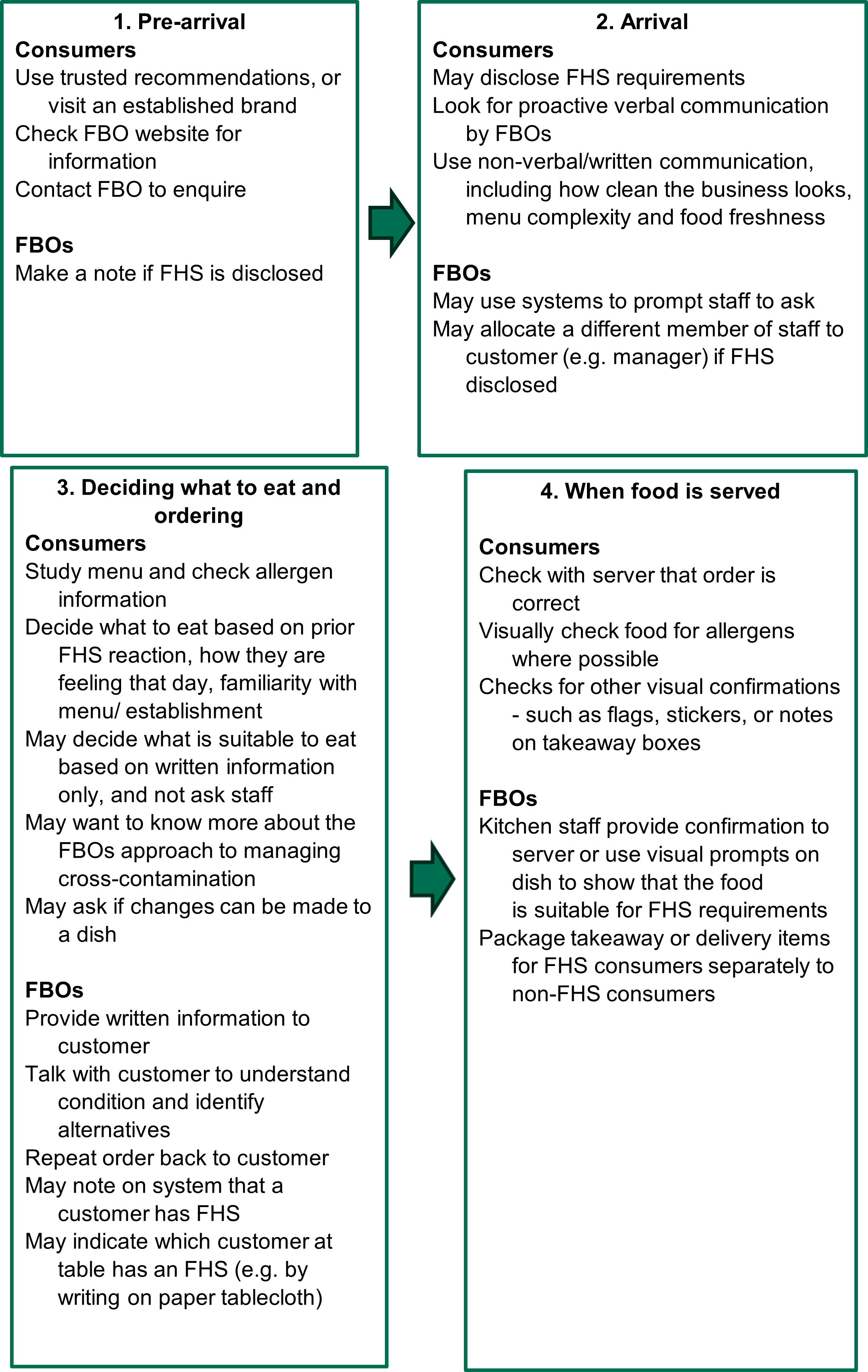
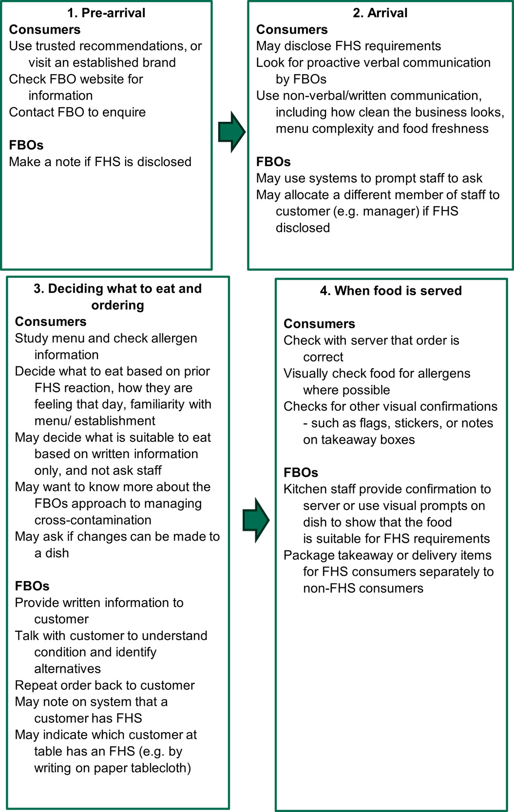
How needs are currently satisfied
Co-creation workshops and interviews with FHS consumers during the user testing stage highlighted a variety of behaviours performed by FHS consumers to satisfy core needs. These included:
-
To ensure safety, disclosing their FHS to servers, checking written allergen information (both pre-arrival and while in a food establishment), and confirming (either through written or verbal communication) that a dish has been prepared safely.
-
To ensure confidence, observing FBO staff, written allergen communications and the physical environment (including, for example, how busy an establishment is) to form judgements about whether an FBO takes FHS needs seriously and is likely to be able to cater for them effectively.
-
To ensure a normal dining experience, doing research in advance (for example, online or by contacting a food business) to figure out what is safe to eat, and/or opting not to disclose to a member of staff and instead relying on written information or their prior knowledge of dishes to make decisions.
The evidence review and co-creation workshops with experts also highlighted the range of FBO staff behaviours and processes which FBOs may put in place to satisfy FHS consumer needs. These included:
-
To ensure safety, providing written allergen information to indicate the presence (or absence) of allergens, requiring staff to ask consumers to disclose if they have an FHS, and putting in processes to ensure clear and effective communication of consumer allergen requirements between staff[15]
-
To ensure confidence, talking with FHS consumers to understand FHS/condition and identify alternatives, repeating orders back to customer, and using visual prompts on dishes to show that the food is suitable for FHS requirements[16]
-
To ensure a normal dining experience, asking each and every customer if they have an FHS[17]
Figure 3 provides an illustration of the behaviours which FHS consumers and FBOs may perform to satisfy key needs. It is based on an unpublished template customer journey model provided by the FSA, which was built on using insights from previous research and from the co-creation workshops with experts and FHS consumers. The full customer journey map is in Appendix B.
Insights into the effectiveness of current communication methods
A variety of factors may limit the effectiveness of communication methods that are used to meet consumer needs. These factors have been identified through a combination of findings from primary research as part of this study, previous research focused on FHS consumers, and wider literature and theory related to effective communications.
FHS consumers may lack motivation to disclose their FHS
Both this study and previous research into FHS consumer behaviour note that low motivation can act as a barrier to FHS consumers disclosing their FHS to FBOs – despite FBOs seeing disclosure as key for ensuring consumer safety. If there are motivational barriers to performing a behaviour then this reduces the likelihood that behaviour occurs.[18]
Reasons for low motivation to disclose vary, but there are two key themes – a consumer’s appraisal of the risk in the situation and beliefs about consequences of disclosing.
Risk appraisal: A FHS consumer is more likely to disclose if they think there is a relevant risk and that disclosure will help them cope with this risk.[19] Some FHS consumers taking part in this study indicated they believe they have the necessary information to make a judgement on whether there is a risk through written allergen information only and / or their own judgement about how likely an allergen is to be present in a dish. They therefore believe that they can be safe without needing to disclose. However, as previous research has shown, consumers may lack awareness that there is a risk of inaccurate allergen information on menus[20] and may also lack knowledge of the additional actions required by FBOs to make a meal safe[21], potentially resulting in over confidence and an inaccurate judgement about risk.
Beliefs about consequences: FHS consumers may also sometimes feel that disclosure won’t protect them from the risk as it should do. For example, if staff appear not to be knowledgeable this can put people off disclosing[22], presumably because they are not confident in the food businesses’ ability to keep them safe (a key need). They therefore are not motivated to disclose. Other perceived consequences which may reduce FHS consumers’ motivation to disclose include: that staff will respond in a way that means they won’t be able to have a normal dining experience (a key need), that they will provide an unhelpful or unconstructive response[23], that they will react in ways that cause the consumer embarrassment[24] and may restrict the consumers’ choices about what they can eat[25]. There is also a concern that other people the consumer is eating with will perceive them as a nuisance[26].
In response to these motivational barriers, previous research has examined the effects of different types of motivational messages on FHS consumers’ intentions to disclose their FHS. For example, gain-framed messages that emphasise benefits or desirable outcomes have been found to be more effective for increasing behavioural intentions than loss-framed messages, that emphasise negative consequences of not adopting a behaviour [27]. This suggests that messaging which highlights a good eating out experience, rather than the avoidance of a food safety risk, are better suited to increasing motivation.
FHS consumers may not pay attention to allergen communications
Human perception is selective[28]. Cognitive economy refers to the tendency for cognitive processes to minimise processing effort and resources.[29] Due to limited processing capacity, people attend to some stimuli in the environment and ignore others. This can result in salience bias, which refers to people’s tendency to focus on items or information that are more noteworthy while ignoring others[30].
These biases were observed during in-situ testing of materials. For example, very few of the FHS consumers who took part in the in-situ tests noticed the sign encouraging disclosure until it was pointed out by the researcher after their food had been ordered. Researchers even observed instances of participants not noticing the sign even when looking directly at it.
Selective attention and salience bias means communications need to be designed and deployed in ways that increase the chances of catching the attention of target audiences. Luminance, texture, contrast, and scale can be used to help communications stand out and be noticed[31]. Timing and context also matter – people become habituated to noticing certain stimuli only at specific points[32]. Finally, personalisation can help make communications stand out, for example by explicitly addressing or representing the target audience (or their interests) in communications[33].
Behaviour change frameworks emphasise the importance of these elements for effective communications. For example, the EAST framework states that, for behaviour change to occur, behaviours need to be[34]: Easy, Attractive, Social and Timely. Applied to communications, this framework highlights the importance of making communications stand out (Attractive) and available at the point of need (Timely) to be effective in driving desired behaviours.
FHS consumers may misunderstand allergen communications
Previous research into FHS consumers’ views towards allergen information on menus highlights a need for allergen information to be simple and easy to read[35]. Features of menus which may affect this include:
-
How much information is provided on a menu – a lot of information can make a menu busy and more complex, and therefore more difficult to process[36].
-
Use of letter abbreviations and symbols – while some studies suggest consumers may find these easier to process[37], there have been food safety incidents arising from consumers misreading or misunderstanding the written information or symbols on a label or menu[38]
-
Use of colour - colours often carry pre-existing associations (e.g. red is unsafe, green is safe) which may affect how written communication is interpreted[39]. Coloured backgrounds may also affect how easy written information is to see and read[40].
Previous research[41] and the co-creation workshops in this research also suggest FHS consumers feel that a lack of consistency in allergen information communication across FBOs is a significant problem. A more standardised system may help avoid consumers having to learn the individual approach of each establishment[42].
As with selective attention and salience bias, these findings reflect the fact that people minimise the time they spend processing information. Consequently, information that is clear, simple and easy to process is more likely to be effective in achieving its communication objectives.
FBO allergen management and communication practices may not address consumer needs
FBO culture and practice can undermine the extent to which FHS consumer needs are met. Previous research has shown:
-
FBO staff may lack knowledge about allergens in general, and/or may lack knowledge about what allergens are present in the food being served[43]
-
FBO staff may forget to ask customers if they have an FHS[44]
-
FBO staff may lack sufficient language and communication skills to relay information accurately and appropriately to FHS consumers[45]
-
Information from suppliers may be absent or not detailed enough for FBOs to ensure information accuracy, plus insecure supply chains may result in last minute changes[46]
-
Updating written allergen information may carry costs for FBOs (such as money and time), meaning they are unable and/or unwilling to do this as regularly as needed[47]
-
It may be impractical to include all allergen information on a menu or a label[48].
-
FBO staff may have a variety of (misinformed) beliefs about allergens (for example, that FHS is a dietary choice), or assume that FHS consumers will always disclose if they are at risk[49]
A key implication of this is that signs, menus, labels and matrices are not a silver bullet for meeting FHS consumer needs. Rather, these communications materials should be understood as part of a wider system, all parts of which need to function effectively to meet FHS consumer needs. This system includes the need for:
-
FBO staff to have the capability (skills and knowledge) and opportunity (time) to effectively communicate with FHS customers, and to be motivated by beliefs to take FHS seriously and knowledge about the allergens present in a dish
-
FBOs to put in place processes and systems for allergen management and communication
-
FBOs to provide additional information on allergen management practices to consumers, for example a website
Principles for written communications
The findings above were used to inform and develop principles for effective written allergen communication. These are summarised below and discussed in more detail in Chapter 7.
These principles formed the basis for developing a variety of prototype executions of signs, menus, labels and matrices. These prototypes were initially tested and refined through the second round of co-creation workshops, after which a final set of prototypes were tested in digital and in-situ testing. The outcomes of these tests are discussed in the next chapter (Chapter 6).
It should be noted that while certain principles are common across all FBO allergen communication, others are particular to a sign or menu. Moreover, how each principle works in practice is context specific. Consequently, principles are grouped into the following categories:
-
written communications to encourage consumers to disclose if they have an FHS on a sign, menu or label (Table 9)
-
written communications indicating the presence of an allergen in a dish or product on a menu, label, or matrix (Table 10)
It should also be noted that these principles were informed primarily by consideration of consumers’ needs. Some (for example, the principle of consistency) may warrant further research with FBOs to understand their feasibility – particularly given the FBO need for flexibility in how they apply principles in the context of their establishment.
Principles described by FHS consumers in this research as the most important for the prototype usability and engagement are shown in emboldened text. This bolding is based on feedback in co-creation workshops and user testing.
6. Findings from user testing of communication materials
A sign prompting consumers to disclose if they have a FHS
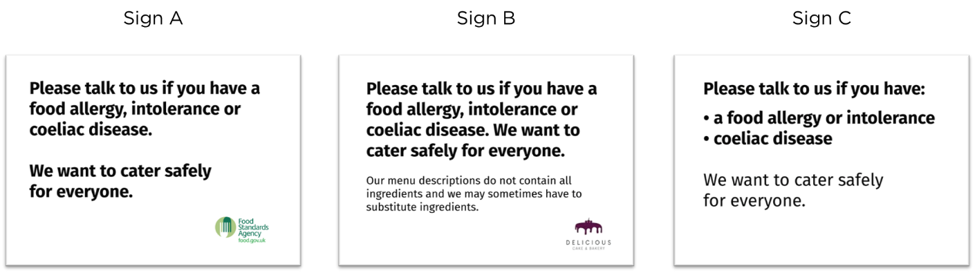
Signs tested
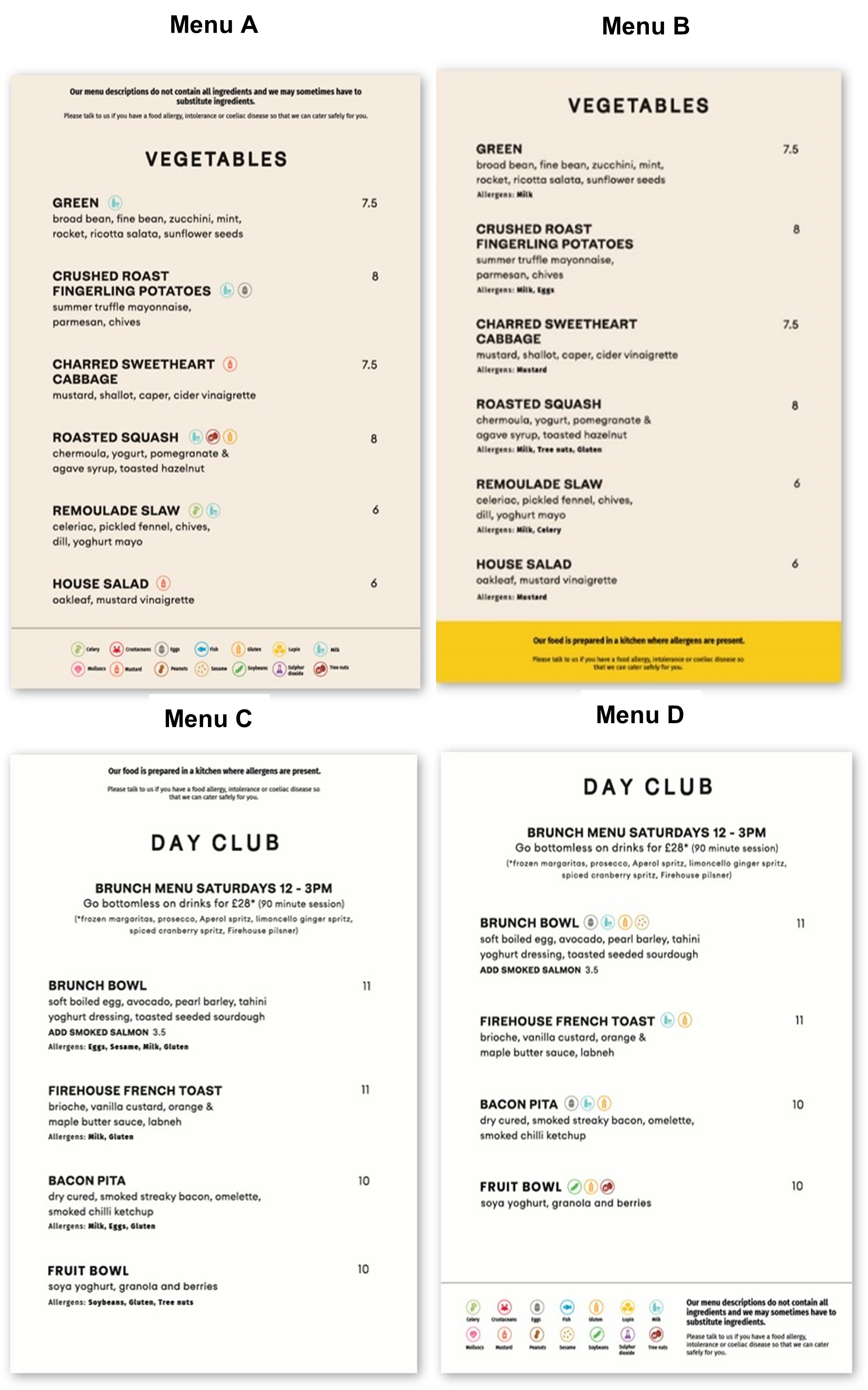
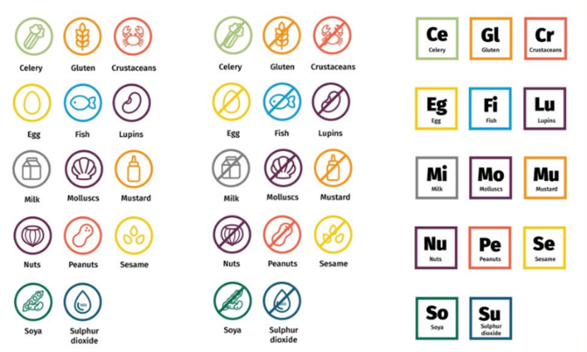
Three signs (A-C) were tested during the online and in-situ consumer research (see Figure 4). The prototype designs all contained the same core message: “Please talk to us if you have a food allergy, intolerance or coeliac disease. We want to cater safely for everyone.” The designs varied in the use of:
-
Design of text – for example, font size and use of bolding to emphasise different aspects of the message.
-
Formatting – for example, using bullet points and spacing to change the layout of the message.
-
Logo - whether a logo was present or not, and if so, whether the FSA or FBO’s logo was used.
-
Messages – Sign B included an additional line stating “Our menu descriptions do not contain all ingredients and we may sometimes have to substitute ingredients.” This specific message was based on previous research showing a lack of consumer knowledge about substitutions and menu accuracy[50]. It was intended to motivate disclosure by highlighting the risk of relying on written information which may not be up to date.

The decision to test these particular signs was based on consumer and expert feedback from the co-creation workshops. During the workshops, FHS consumers and experts said signs need to be clear and simple and should communicate that FBOs care about the safety of their consumers. Signs also need to stand out and be accessible to readers with different needs. Specific considerations that emerged from this stage included that:
The sign should:
-
Provide a clear and simple call to action so consumers know what the FBO is asking from them.
-
Show empathy for consumers with FHS is valued. However, what matters most is consumers having confidence that they will be able to have a safe dining experience.
-
Use friendly language to encourage consumers to feel comfortable disclosing their FHS.
-
Mention coeliac disease in addition allergies and intolerances, due to it being a different condition (an autoimmune condition).
It should not:
-
Use colour at the expense of the legibility of the sign (e.g. due to coloured backgrounds reducing the contrast between the message and the background). Though colour on signs can be useful for grabbing attention and cueing certain associations (e.g. red = danger).
-
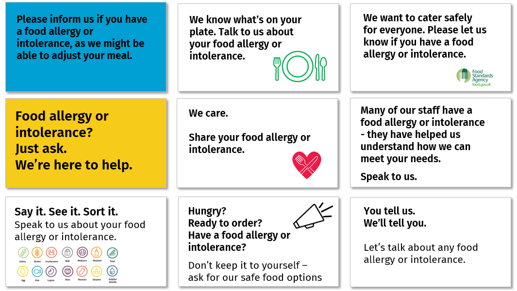
Use graphic elements which distract from the message, for example icons to signify the need for a consumer to talk (a megaphone) or to show a business caring (a heart).
-
Use humour and catchphrases as it can obscure meaning and create confusion.
The nine early prototypes that were developed and tested during the second round of co-creation workshops are shown in Figure 5. The sign with the white background and the FSA logo in the corner with the message: ‘We want to cater safely for everyone. Please let us know if you have a food allergy or intolerance’ (top right in Figure 5) emerged as a strong favourite across groups, as it met many of the considerations described above. This sign formed the basis of the prototypes taken through to user-testing.

User testing findings
Signs rarely led to FHS consumers disclosing their FHS, however, in follow-up interviews FHS consumers said they consider them important.
In-situ tests generated mixed evidence around the influence of signs on likelihood to disclose. There was an equal split of participants who disclosed their FHS to FBO staff, versus those who did not. Among participants who did disclose, almost all did so without noticing the sign. Most of these said they always disclose as a matter of routine; some did so in response to the server asking.
“They don’t usually ask because there’s not many people who have allergies. So, I just bring it to their attention.”
In-situ participant, restaurant
“A lot of places do fish and seafood, so I have to let them know [about my food hypersensitivity], or in case they use sesame oil or peanut oil… So yes, I have to disclose it all the time.”
In-situ participant, restaurant
Despite these findings, FHS consumers widely considered signs to be important for ensuring the safety of (other) FHS consumers, and for building confidence in FBOs, for example because they demonstrate that FBOs have considered FHS consumer needs.
Signs were often not noticed. Consumers recommended better placement and the use of colourful logos to improve salience, though this may still not be enough to capture attention.
The most common explanation for why the sign did not influence disclosure was because very few of the FHS consumers who took part in the in-situ tests noticed the sign until it was pointed out by the researcher after their food had been ordered. This suggests the salience of signs could be improved. In-situ testing participants suggested salience could be improved by positioning signs in places where consumers are likely to look, such as on front-doors, on or near menus, and around customer interaction points, for example, payment points. It is worth noting that this still may not be effective; researchers observed instances of participants not noticing the sign even when looking directly at it.
Digital testing further suggested that placement considerations vary depending on the service context. Participants in these online tests said that, in restaurants, signs should be incorporated at the front of the venue (e.g. on door fronts) and potentially as a part of the table setting. For cafes, they recommended visible wall placement near the service counter and possibly multiple placements due to the fast-paced environment. For market stalls, participants recommended clear, visible signage on counters or attached to display cabinets.
Inclusion of a logo was also generally preferred by participants. One reason for this was because logos were viewed as making the sign more salient, as images and colour were more noticeable than plain text. The sign without a logo (Sign C) was perceived as the least salient because it was plain and visually unappealing.
Finally, the use of emboldened text and large font size was commonly preferred because it made key messages readable from a distance.
Messages highlighting risks of non-disclosure were perceived as more motivating.
Some consumers did not disclose as they were confident that they could make a safe meal choice without doing so. This replicates findings from previous research (see Chapter 5 for further discussion).
In terms of motivation, only Sign B, which sought to motivate by highlighting the risk of relying on written information only, appeared to influence confidence levels in a way that motivated disclosure. This sign was tested in the café and was not noticed by any participants during their purchase. However, during follow-up interviews, several participants remarked that the additional message increased their perceptions of risk and may have motivated them to disclose if they had seen it.
“This [bold message] is the friendly bit, but this [additional message] below is probably more important than that [bold message], because ‘What are you going to substitute?’ That’s very important to me. So, I would say it would all need to be in bold… because that’s [bold message] the invite and this [additional message] is the information.”
In-situ participant, café
Despite this finding, Sign B was also found to be too wordy by other FHS consumers and less effective at meeting the principle of being simple and getting to the point.
While logos increase consumer confidence that allergen management is taken seriously, use of the FSA logo signals (incorrectly) that an FBO has been accredited and can therefore be misleading.
FHS consumers believed signs which included a logo indicated that the FBO took allergen management more seriously than those without a logo.
Initially, FHS consumers preferred the sign with the FSA logo (Sign A) as it indicated the FBO was compliant with safe allergen management practices. Specifically, consumers were reassured that the FBO had been accredited by the FSA to cater for them safely.
“I like the fact that they’ve got Food Standards Agency’s logo on there… it shows that they do check their catering to clients, that they do it safely… I feel like it’s all been checked… It always helps when you have a good official body to keep everything in line.”
In-situ participant, restaurant
However, after the researcher explained that the use of such disclosure notices was unlikely to be related to any official checks, FHS consumers perceived the inclusion of the FSA logo was misleading, and so to be avoided.
In this context, FHS consumers next preferred the sign with the FBO logo (Sign B) as it indicated the FBO took ownership and responsibility for allergen management and customer safety.
FHS consumers least preferred sign was the one without a logo (Sign C), which was associated with an FBO doing the bare minimum to comply with regulations. In these cases, the sign did not improve (and possibly reduced) confidence among consumers that the FBO took allergen management seriously.
Simple messages, emboldened larger font and spacing of information makes messages easier to process
FHS consumers preferred signs that used simple language and that only communicated essential information. However, opinions varied over what constituted an appropriate amount of detail. For example, most FHS consumers saw Sign B (with the additional risk message about menu descriptions not including all ingredients and having to substitute ingredients sometimes) as being too wordy. However, some consumers thought this information essential for making a safe choice, and therefore appropriate to include.
Design and formatting also emerged as key considerations for improving the clarity and simplicity of the signs. FHS consumers preferred the use of emboldened text, large font size and spacing out information by using line breaks, because it made key messages easier to read. However, they saw the use of bullet points as over complicated and unnecessary.
Table 11 below provides a summary of views on signs from the online and in-situ FHS consumer testing.
FBO views on the signs
Owners of all three food businesses were interviewed about the signs. Test signs displayed in the food businesses for the fieldwork period were as follows:
-
Sign A was tested in a restaurant with table service. The restaurant does not currently use an allergen disclosure sign but has a notice to disclose on the menu.
-
Sign B was tested in a café with counter service (the FBO’s logo was used for this execution). The restaurant does not currently use an allergen disclosure sign but has a notice to disclose on the menu.
-
Sign C was tested in a market stall. The stall currently has a large (approx. 70 x 40 cm), handwritten allergen disclosure sign on blackboard using white marker and capitalised text. The current sign reads: ALLERGENS[51] OR INTOLERANCE. *PLEASE ASK A MEMBER OF THE STAFF FOR ALLERGEN INFORMATION*
Given the small sample size, broader implications cannot be drawn from the FBO interviews. Findings are not representative and used for illustrative purposes only.
Overall, FBO feedback on the sign fell into three areas: the need for a sign; placement of the sign; and views on the sign message.
FBOs expressed different views about the need for a sign.
Both the café and market stall owners believed that signs in general were reassuring and could encourage consumers to disclose any FHS needs. For the market stall especially, their current sign was the main way to communicate about allergens to customers. The café did not currently have a disclosure sign, as they felt the message was better placed on the menu as it was more likely to be seen at point of order. However, after testing sign B, the cafe owner felt the sign provided “peace of mind” for both customer and the business (to help protect them in case of a claim). The café owner asked to keep the sign for ongoing use. The restaurant owner was less convinced on the need to use a sign, as they asked customers to disclose their allergen needs at point of order.
FBOs had different views on where it would be best to place a sign, linked to their service model and aesthetic considerations.
The restaurant owner had concerns about where to place the sign. The restaurant had artwork and pictures on the wall, and the sign was not noticed during fieldwork. The restaurant owner believed a sign would need to be large and visually obvious to stand out, which would not fit well with the look and feel of the restaurant. Moreover, the restaurant owner also believed that customers were more likely to take notice of a message to disclose on a menu than a sign on a wall, as service was at the table.
The cafe and market stall owners had fewer concerns about sign placement – mainly as customers for both businesses would order food in one place (at the counter or the stall front). This meant owners perceived it as relatively easy to place a sign nearby so that it would be noticed, the assumption being that a sign placed near the food ordering location would be more noticeable. Note that observations during the in-situ tests found this assumption to be incorrect in most cases.
FBOs did not have strong views towards the content of messages, however, the need for signs to be visually appealing was noted.
The restaurant and café owners did not have any preferences or particular views about the message on their test sign, or those of the other prototypes – feeling they were all fairly similar. The market stall owner, who tested a sign with a bullet point style, said the message felt ‘a bit academic’ and the overall execution was less “eye-catching” compared to their chalkboard signs which “fitted the aesthetic”. The market stall owner did not believe the sign made any difference to how her customers shopped.
FBOs did not have strong views towards the need for and choice of logo.
There were mixed views on the need for a logo on the sign, though no FBO was opposed to this. Overall, there was a slight preference for the FBO logo to appear on the sign, rather than the FSA logo, as it made the message feel that it was from the business.
Allergen information communication for written materials to indicate presence of allergens
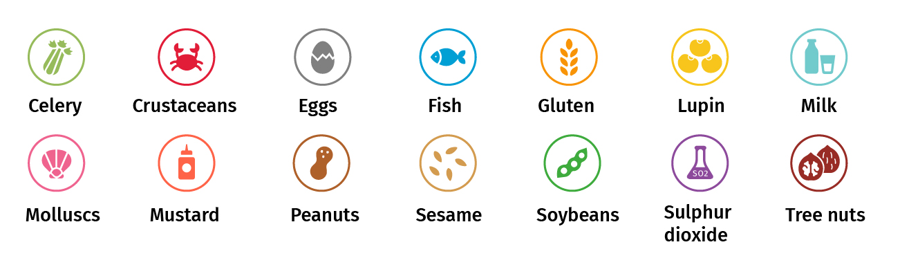
Menus
Menus tested
Four menu prototype designs (A-D) were tested during the digital consumer research (see Figure 6). Menus based on these designs were also tested in-situ in two food business settings. Specifically, the FBOs current menu was redesigned in the style of the following prototypes:
-
For a restaurant with table service, their existing menu was redesigned with icons to indicate the presence of allergens in a dish. This was done in the style of prototype Menu D.
- The corresponding emboldened text menu (Menu C) was also comparatively tested during the interview.
-
For a café with counter service, their existing menu was redesigned with emboldened text to indicate the presence of allergens in a dish. This was done in the style of prototype Menu B.
- The corresponding icon menu (Menu A) was also comparatively tested during the interview.
The prototype designs were used to test the following variables:
-
Circular icons vs. emboldened text
-
Placement of disclosure messages (top vs. bottom)
-
Background of disclosure message (colour vs. no colour)
-
Content of disclosure message – the main disclosure message ‘Please talk to us if you have a food allergy, intolerance or coeliac disease so that we can cater safely for you’ was on each menu. The additional risk message was varied to either highlight cross-contamination risks (something which FHS consumers are more likely to be already aware of as a risk) or to highlight that written information on menus may be incomplete (as not all ingredients are listed) or inaccurate (due to ingredient substitutions) – something which FHS consumers may be less cognisant of.
Table 12 summarises the differences in how allergen information was displayed for the menu prototype designs.

Co-creation workshop insights informing menu prototypes
The design of the prototype menus was based on feedback from the co-creation workshops. During these workshops, FHS consumers and experts said that menus which utilised colourful icons or emboldened text were easiest to understand and supported customers to identify menu options which were most suitable for them. Specifically:
-
icons could help FHS consumers choose between dishes more quickly.
-
the use of colour helped to draw attention to the icons.
-
emboldened text was the simplest way to indicate presence of an allergen in a dish.
Whilst participants said they were not currently familiar with a system of allergen icons; it was mentioned that (if a consistent system was implemented) over time they would learn which icons were relevant to them, making them easier to use.
Additionally, during the ideation stage, 3 different icon executions were discussed and compared prior to the protypes being finalised for testing. These are shown in Figure 7.
When reviewing these prototype menu executions, FHS consumers and experts said that:
-
using letter abbreviations for the 14 allergens was cognitively hard to process, and cued associations with chemicals and the periodic table.
-
using a strikethrough on an icon to indicate the absence of an allergen in a dish was not intuitive,[52] and led to menus being visually complex and hard to navigate
-
circular shaped icons were more familiar than squares, and consequently easier to use.
Consequently, circular shaped icons were selected to use in testing stage, with the following minor revisions based on consumer and expert feedback:
-
each allergen should have a separate colour.
-
icons should be bolder, with greater use of colour to help them stand out.
-
the sulphur dioxide, celery, egg and milk icons should be changed to more clearly reflect the allergen of interest.
User testing findings
How consumers used menus
FHS consumers used menus in a variety of different ways, and context was especially important in the in-situ testing stage
FHS consumers said their familiarity with the cuisine, the ‘look and feel’ of the restaurant (including how busy and professional it looked), how hungry they felt, their mood and what they fancied eating, together with the time they had to peruse the menu,[53] all influenced how a menu was read and how allergen information was used.
Typically, FHS consumers scanned a menu from top to bottom and left to right. They began their search by looking at different categories of food (for example, pasta or salad), to make a choice about what they broadly wished to eat. This was done without a focus on any allergens present in the dishes. Once a category had been decided, a more detailed review of individual dishes was undertaken.
For emboldened text menu executions, the detailed review was done a dish at a time, with the allergen information for each dish read in turn. For icon menu executions, most consumers used icons to identify dishes they could not eat and focused on those where the icon was absent. Other shortcuts were sometimes used to identify suitable dishes to eat, for example those labelled vegan in the context of someone with a milk intolerance.
Disclosure messages on menus
Placing disclosure messages on menus, at the top of menus, and within a coloured box can increase salience
As shown above in Table 12, each menu in the testing stage had an allergen disclosure message. The position and content of the message varied across the menus. Menu B also used a coloured box at the bottom of the menu to draw attention to the message.
Overall, from the in-situ testing, disclosure messages were more likely to be noticed:
-
on a menu rather than on a sign.
-
when the message was at the top of the menu rather than the bottom.
-
when the message was placed in a coloured box rather than just as text.
Overall, FHS consumers said that putting an allergen disclosure message on a menu was more likely to be noticed than on a sign, as their attention is focused on the menu at point of choosing food.
“I feel like it’s better to have it [the message] on the menu rather than on the wall somewhere, because that’s where people are going to look. I feel like the top things people are going to do is check the menu and speak to the staff.”
In-situ participant, restaurant
Additionally, as information is generally read from top to bottom and left to right, the allergen disclosure message on Menu D - which was in the bottom right-hand corner - was least noticeable (and was not noticed by several consumers in the restaurant during the in-situ test).
Disclosure message content generated mixed responses and some consumers wanted the call to action to be foregrounded more clearly
As noted in Table 12, each menu included one of two different disclosure messages:
-
Message 1: Our food is prepared in a kitchen where allergens are present. Please talk to us if you have a food allergy, intolerance or coeliac disease so that we can cater safely for you.
-
Message 2: Our menu descriptions do not contain all ingredients and we may sometimes need to substitute ingredients. Please talk to us if you have a food allergy, intolerance or coeliac disease so that we can cater safely for you.[54]
FHS consumers saw both messages as reassuring and clear, though both were seen as wordy, and some consumers questioned whether the reason for disclosure was really needed. In this context, generally consumers preferred the ‘please talk to us’ part of the message to be emboldened and placed before the reason why – a finding which reflects the importance of communicating a clear and simple action that is easy to do[55]. No differences were found in consumers reactions to the content of the messages.
Written allergen information on menus
Emboldened text executions were overall perceived as easier to use than icons, however both worked in practice.
FHS consumers in the online testing said emboldened text executions were easier to read than icons. This is because the emboldened text executions were visually clearer, unambiguous and did not require the use of a legend to identify the allergen of interest. When discussing the icon menus, FHS consumers found Menu D most difficult to use, due to the placement of the icon legend being adjacent to the disclosure message at the bottom of menu. They said having such a large amount of detailed information in a small area of the menu made it harder to use.
In the in-situ testing, where people were actually using the menus, opinions were more mixed. Overall, both icon and emboldened text executions were seen as good approaches by participants. Emboldened text executions were easier to read (icons required more cognitive work to interpret), however icons were seen as having the advantage of enabling them to quickly scan the menu and find a dish that was safe to eat. This view was also expressed by some consumers in the digital testing.
“Well, [emboldened text] it’s easier on the eye, in the sense that it is not a lot of brainwork… It’s all in one page, and I don’t have to go to the bottom to work out what’s in the dish… It’s not as pretty looking as the icons, however it’s more straight to the point… You don’t want to be sitting here trying to work out what each thing means”.
FHS consumer, in-situ test, restaurant
“I think icons are easier to recognise… You still have people who can’t read properly, whereas they will recognise icons.”
FHS consumer, in-situ test, market stall
Coloured icons perceived as providing additional benefits for ease of use. Improved colour coding and consumer familiarity may also increase their utility.
Consumers in the digital testing raised concerns over whether certain colours for the icons were too alike and whether the colour was intuitively related to each allergen. For example, as illustrated in Figure 8, consumers said the red and pink colours for crustaceans and molluscs were very similar, and alike to mustard. Additionally, pink and dark orange colours were not associated with molluscs or mustard respectively[56].
“People’s eyes may be drawn to a colour more so, than black and white… Although they don’t really relate- milk being blue, I think it’s more eye catching.”
FHS consumer, in-situ test, café
Consumers in the co-creation workshops noted that barriers to processing icons might reduce over time as they became more familiar with their icon. However, this was not raised by participants in the user tests.
Table 13, below, provides an overview of what FHS consumers in the in-situ and online testing thought worked well and less well for menus that used icons versus emboldened text.
Unintended consequences of communicating the presence of allergens in a dish
FHS consumers involved in the in-situ testing said that the menu executions made them feel confident that the business took allergen management seriously and the food was correctly labelled. However, this gave rise to an unintended consequence for some FHS consumers who said that this level of confidence made them less likely to disclose their allergen requirements, unless they were asked by waiting staff. This was because they believed they had all the relevant information to make their own food choices safely.
"I do [disclose] sometimes, I feel like today I didn’t need to because the menu is very obvious. It says exactly what has dairy and what doesn’t."
In-situ participant, restaurant
It should be noted that, for safety reasons, all consumers involved in the in-situ tests only had a mild or moderate FHS, and it is not clear that customers with a severe food allergy would feel confident not disclosing. Nonetheless, this finding suggests that, in addition to written disclosure messages, verbal communication is important for prompting disclosure.
FBO views on the menus
Owners of the restaurant and café were interviewed about the prototype menus, where respectively an icon and emboldened text menu were tested. Given the small sample size, broader implications cannot be drawn from the interviews and findings are used for illustrative purposes only.
FBO using a menu with an icon design
The icon menu was tested in a restaurant providing table service. The restaurant’s current menu design[57] is printed on white paper and uses a black font for the menu description. The current menu uses emboldened abbreviations to indicate gluten free dishes (gf) and whether a dish contains nuts (nt). Vegan (vg) and vegetarian (v) dishes are also shown. Additionally, the following disclosure message is printed in emboldened text in the bottom left-hand corner of the menu: If you have any dietary/allergy requirements please inform a member of staff.
The test menu was designed to be identical to the current menu, other than the following changes. The gf and nt abbreviations were removed, and coloured icons added to show the presence of any allergens for each dish. The icon legend and a new allergen disclosure message (message 2 above) were also added to the menu, at the bottom right-hand corner.
When considering the redesigned menu with icons, the restaurant owner said the menu was visually pleasing, and that showing all allergens (from the 14) present in a dish was a positive step. The restaurant owner said the use of icons were in keeping with the business’ brand style, though it may not be appropriate for more formal restaurants. When exploring the icons in detail, the restaurant owner viewed certain icons (lupin and sesame) as less intuitive than others.
Overall, the restaurant owner did not foresee many problems in being able to recreate the menu, providing the icons were easily accessible and integrated into the text or design applications used by the business (MS Word or Canva). The restaurant owner preferred the use of icons over emboldened text, mainly due to the number of dishes on the menu, and a concern that using emboldened text would make the menu look very busy. The restaurant owner prints their current menus and noted that there would be additional costs associated with the use of coloured ink for the new menu design, though this was not seen as significant. The restaurant owner updates their menu weekly and has a relatively stable supply chain, however, they do occasionally have last minute ingredient substitutions. The owner would reprint the menu (including allergen information) in such instances.
The menus were only used for the testing purposes in the restaurant, and so were not seen by other customers. In part, this was due to a menu change that occurred after the new prototype had been produced and printed (the design was produced by the research team, rather than the FBO).
In this context, the restaurant owner said it was hard to know the impact of the redesigned menus on customer service more generally, though they did not anticipate this to be a concern. The restaurant placed greatest focus on a conversation between waiting staff and customers about allergen requirements, and staff are trained to ask customers about their FHS requirements at point of order (this was observed in the in-situ tests, including for other customers). The restaurant owner believed written allergen communication on the menu was potentially helpful, but not a substitute for verbal communication. The restaurant owner had no strong opinions on the disclosure notice on the menu, other than it was a bit wordy.
FBO using a menu with an emboldened text design
The emboldened text menu was tested in a café providing counter service. The café’s current menu design is printed on black paper and uses a golden capitalised font to indicate the main categories of food (e.g. salads) and a white capitalised font for the dish description. The current menu uses emboldened abbreviations to indicate gluten free dishes (GF), whether a dish contains nuts (N) or sesame (SE). Vegan (VG) and vegetarian (V) dishes are also shown. Additionally, the following disclosure messages is printed in capitalised text in the bottom centre of the menu: ‘All our food is freshly prepared in a kitchen where nuts, gluten and other food allergens are present. If you have a food allergy or intolerance, please let us know before ordering.’
The test menu was designed to be identical to the current menu, other than the following changes. The GF, N and SE abbreviations were removed, and emboldened text in white capitalised font added to show the presence of any allergens for each dish. A new allergen disclosure message (message 1) was also added, in a golden box at the bottom centre of the menu.
When considering the redesigned menu with emboldened text, the café owner said they had no major concerns, other than the amount of text and the menu looking “crowded and less easy on the eye”. Overall, the café owner did not foresee many problems in being able to recreate the menu, other than the time it would take to make. The café owner updates their menu every 3-4 months and has a relatively stable supply chain. The owner said it is rare for them to make last minute changes to the menu.
When comparing the icon prototype to their test menu, the café owner believed icons may use less space and be more visually pleasing than text. But overall, they would need to see how both menus looked in practice, how it would fit with their brand and whether the information was clear to customers and staff.
The café test menus were displayed at the counter during the 4-day fieldwork period and seen by all customers – both those who took part in research and regular customers.
The café owner said several regular customers had noticed a change in the menu design, and asked questions about this.[58] A few customers asked whether dishes were still gluten free, as the GF symbol had been removed. Beyond these issues, the café owner did not have a strong view of the impact of the redesigned menu on the business, though over time believed it may make service quicker as more information was given to the customer. The café owner said it is the responsibility of customers to disclose their FHS. Staff do not initiate asking customers about their FHS.
Labels
Labels tested
Three label prototype designs (A-C) were tested during the online consumer research (see Figure 9). The prototype designs varied in terms of:
-
whether they used icons or emboldened text to indicate the presence of allergens in a dish
-
for icon executions, whether they only showed allergens which were present, or whether they showed all 14 allergens and indicated which of those were present
All prototype designs also included a message encouraging FHS consumers to disclose any allergies, intolerances or coeliac disease.
For the in-situ tests, labels were tested in:
-
a market stall, where the FBO’s existing label was redesigned with icons to indicate the presence of allergens in a product. This was done in the style of prototype Label B.
- additionally, label prototypes A and C were tested during the interview.
-
a café, where the FBO’s existing label was redesigned with emboldened text to indicate the presence of allergens in a product. This was done in the style of prototype Label C.
- additionally, label prototypes A and C were tested during the interview.

User testing findings
Placement of written communications affected the overall salience of the labels
To use labels, FHS consumers need to notice them. In-situ tests highlighted the importance of placement and physical environment for the visibility of labels. For example, almost all participants who visited the market stall noticed the label, versus only a small minority who visited the cafe. Market stall participants remarked that it helped that labels were placed immediately in front of each dish, as their eyes went “straight to the food”. In the café, the menu was stuck to a window away from where the products with labels were placed, and as many participants ordered from the menu, they did not see the labels.
Not all FHS consumers who saw the labels paid attention to the allergen information. Others noticed the information but still confirmed with staff whether a product was safe to eat
FHS consumers who noticed and used the labels used them in one of two ways. Some focused on the allergen information first, which they used to eliminate unsafe options before choosing from the remaining options.
“I basically scanned them [labels] to check that there was nothing on the labels of the things I was considering buying. […] I scanned, discarded a couple because I saw they had nuts in them, so I discarded them straightaway and then looked at the ones that I quite like to eat and there was probably four of those…”
In-situ participant, market stall
Others focused on the name of the product. For some FHS consumers, the name itself was perceived as sufficient for making safe choices about what to eat. For example, one consumer felt that because they have eaten the ingredients in a product previously, the product was fine for them to eat.
“I just looked at the product…I think I knew it was safe… because I’ve had brownies in the past and I’ve had Biscoff biscuit. So put them together and it’s a no-brainer that there’s nothing in there.”
In-situ participant, market stall
In other cases, while still focused on product name rather than the allergen information, FHS consumers would also ask the server to verbally confirm whether it was free from a specific allergen.
Disclosure messaging lacked salience due to small font size
As noted, all labels in the testing stage each had an allergen disclosure message on them. These messages were identical for all three labels. A small minority of participants in the in-situ testing said they disclosed their FHS to the FBO after seeing this message. However, many participants did not see the message when making a purchase. There was a consistent view that, for the disclosure messages to be effective, it needed to stand out - for example by using emboldened or capitalised text.
“The text is not very good. All lowercase and its not even in bold… It didn’t catch my eye. It was not eye-catching.”
In-situ participant, market stall
Labels combining coloured icons with emboldened text and only including allergens that are present was perceived as most salient, clear and easy to use
In the online tests, Label B (icons showing which allergens are present) was seen as very easy or easy to use by most participants. This execution was preferred because it used emboldened text and coloured icons which were easy to read and understand, while remaining not overcrowded. Label A (showing all 14 possible allergens with ticks for which were present) was the execution most likely to be seen as difficult to use. This was because the inclusion of all 14 allergens and tick-boxes for each made the label overcrowded with too much information.
Overall, participants in the in-situ testing ranked the executions in the same way. They liked the use of coloured icons because they thought these were more eye-catching and likely to stand out compared to emboldened text alone. Some also noted that icons can be easier to use than just text for consumers with reading or learning difficulties.
“Just at a glance, when I see the picture [icon], it draws my attention to it more than if it was just mentioned there… It potentially might help dyslexic people as well. So, they can relate to the signs more than they do the words.”
In-situ participant, market stall
However, participants were concerned that including all the allergens on the label made it too crowded, and therefore less easy to use. As such, they tended to rank Label A (all 14 allergens with tick boxes) as their least preferred.
“Label A is too busy… I’ve seen in other restaurants where they would tick whatever [allergens] it has, and you spend double the time browsing through all of the labels to see ‘which one can I eat’… This is too much.”
In-situ participant, café
Label C, which used emboldened text only, was perceived as clear and easy to use, but not as eye-catching. Some participants thought that, if colour was removed, emboldened text would be better than non-coloured icons. This was because non-coloured icons were seen as less clear than coloured icons and potentially more difficult to use than emboldened text.
Table 14 provides an overview of what elements the in-situ and online participants thought worked well and less well for each of the label executions used for consumer testing.
FBO views on the labels
Owners of the market stall and café were interviewed about the label prototypes, where respectively the icon or emboldened text label were tested. Given the small sample size, broader implications cannot be drawn from the interviews and findings are used for illustrative purposes only.
FBO using a label with an icon design
The icon label was tested in a market stall. The market stall’s current label design comprises several small blackboards, one for each product. The product name is handwritten using a white erasable marker. The current label design does not have any information on allergens present in a product. The FBO does display a sign asking consumers to disclose if they have a food allergy.
It was not possible to recreate the market stall test labels using the current label design. This was because the icons would need to be either hand drawn or produced as a sticker, and stuck onto the blackboard, neither of which were simple to execute. Consequently, the test designs were printed on white paper and laminated. The product name was printed, using a handwritten-style font[59]. Coloured icons showing any allergen present in a product were provided on each product label, with the allergen name printed underneath the icon. Additionally, the following disclosure message was printed on each label: ‘Please talk to us if you have a food allergy, intolerance or coeliac disease. We want to cater safely for everyone’.
The market stall owner reported that it was common for them to sell new products or make changes to products. Moreover, due to how the products were made, the owner said the risk of allergen cross contact was relatively high. The owner said that previously they had used emboldened text to indicate the presence of allergens in the products but had stopped doing this as it was believed to be potentially misleading for customers due to cross-contact risks. Rather, they prefer to discuss any FHS requirements with customers, and proactively ask customers to disclose these (this was observed).
The market stall test labels were displayed at the stall during the 4-day fieldwork period and seen by all customers – both those who took part in research and regular customers.
The market stall owner said the test labels were neat, informative, and reassuring for customers. However, the owner said that they felt that, in the period the labels were displayed, they had fewer people than normal disclose FHS and customers were asking less questions about the products overall. While this led to a smoother transaction process, it raised concerns over whether it help managed allergen risks. It should be noted that these views were based on the owner’s subjective impressions of changes in the behaviour of their customers. The research was not able to validate objectively whether any such decrease occurred, or whether the labels were a factor in this change.
“It’s good in the sense that it reduces the time that the customer stood there, which is great. We’re always trying to reduce the queue and also have a quick transaction. It’s good in the fact that the customer feels confident that they’ve got all the information to make that purchase and feel reassured. But then obviously, I, as a business owner, like my staff to have a conversation about allergens with a customer that has an allergy just for that second layer of protection that everything’s been discussed and we’re all okay”
FBO, market stall.
Overall, the owner felt that recreating the labels was not believed to be particularly hard for the business, providing the icons were accessible and provided in an easy-to-use template. It would not be possible to use current blackboard label design, as each icon would need to be hand drawn. Consequently, all labels would need to be recreated from scratch on laminated paper. The use of icons was also thought to limit the design of the labels, as it would need to be on a white background to be visible. The label prototype using emboldened text was seen as similar to what the owner has previously provided and had since rejected.
FBO using a label with an emboldened text design
The emboldened text label was tested in the café with counter service. The café’s current label design uses emboldened abbreviations to indicate gluten free dishes (GF), whether a dish contains nuts (N) or sesame (SE). Vegan (VG) and vegetarian (V) dishes are also shown. There is no allergen disclosure message on the label, though this is printed on a menu, and displayed near the products. The current label design uses laminated black paper and capitalised golden font for the product name.
The test label was designed to be identical to the current label, other than the following changes. The emboldened abbreviations (GF, N and SE) were removed. Beneath the product name, the full names of any allergens present in the product were written in white emboldened capitalised text. Additionally, the following disclosure message was also written in white emboldened capitalised text: ‘Please talk to us if you have a food allergy, intolerance or coeliac disease. We want to cater safely for everyone’.
When considering the new labels, the café owner had positive views. The owner said writing out each allergen name was clear and that disclosure request was also clear and informative. As each label was separate, the owner said that the emboldened text execution was less busy than when shown on the menu. The café owner did not believe it would be difficult to recreate the emboldened text label. When comparing the icon label prototype to the emboldened text test label, the icon prototype was thought to have greater aesthetic appeal though was less clear.
The café owner said the main impact of the labels was that customers still asked whether products were gluten free. Consequently, the owner questioned whether it was helpful to remove the GF abbreviation, as customers frequently used this. The owner was not able to identify other impacts from using the label, positive or negative, including whether the addition of a disclosure messages encouraged more customers to say if they have an FHS.
Allergen matrices
Matrices tested
Four prototype matrix designs (A-D) were shown to participants during the online and in-situ consumer research (see Figure 10). Unlike executions of other materials (e.g. menus) allergen matrices were not tested in-situ. Instead, consumers were shown prototype designs during the follow-up interview and asked for their feedback.
The prototype designs varied in terms of:
-
Whether they used colour or black-and-white
-
Whether they indicated presence of allergens using ticks or allergen icons
A version of Matrix B was developed and tested during the co-creation workshops. Based on feedback, an additional prototype that used icons rather than ticks in the column was designed to prevent consumers having to go back to the header row to identify what allergen is being referred to, potentially increasing useability. As well as colour, black and white executions were also developed to explore whether this influenced ease of use.
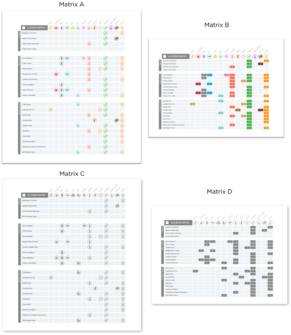
User testing findings
As matrices were not tested in-situ, the following findings are based on how consumers said they would use a matrix, if presented with one.
Consumers are able to use matrices to correctly identify allergens in a dish, although not everyone uses them in the same way.
FHS consumers said they would use a matrix in one of two ways. Some said they would start by reading across the top row and then read down the column to identify and eliminate options that were unsafe for them to eat. They would then choose from the remaining safe options. Others said they would start by reading down the left-hand side to identify a dish they wanted to eat. They would then read across the row to check that their preferred dish was safe for them to eat.
“I would start with, ‘What do I fancy’, and then I would scroll across and be like, ‘What have they got in there? What can I have, what can I not have?’”
In-situ participant, restaurant
“I would look for nuts and see anyone where the box is clear, and then pick what I would eat off that.”
In-situ participant, restaurant
In either case, FHS consumers felt it was clear to them which dishes contained their specific allergens. Both ticks and icons were understood by participants to signify that the item was not safe for them to eat. That said, some FHS consumers questioned whether icons would be universally understood, creating space for misinterpretation.
Coloured icons perceived as easiest to use overall.
Most FHS consumers from both the online and in-situ tests believed that Matrix A (coloured with icons) was a better execution. This was primarily because the combination of iconography and colour coding made it easier to differentiate between columns and rows, and also avoided needing to look back to the top of the column to identify the allergen of interest. Where participants did prefer Matrix B (coloured with ticks), this was primarily because ticks were seen to be more standardised, clear, and neutral. Some participants felt that both executions were equally as useful in identifying the presence of allergens.
“I think matrix A is better. The colours just make it more distinguishable. All the tick boxes in that one [matrix D] are all the same colour, so it kind of merges together. I’d still be able to work it out, but I’d be able to work it out quicker with matrix A… I think with the icons, anything that helps distinguish between allergens is useful…it does tell you what each of them [allergens] are.”
In-situ participant, market stall
If colour is removed, ticks perceived as easier to use than icons
When executions were made black and white, consumers mostly found them more difficult to use, saying they required more time to interrogate, and created more room for error. Icons in particular, became harder to distinguish without colour. Consequently, consumers felt that in black and white, the use of ticks was a safer design feature.
Findings from the online and in-situ FHS consumer testing is summarised in Table 15.
FBO views on allergen matrices
As noted, the allergen matrices were not tested in any food business setting, though the protypes designs were shown to each business owner. All 3 FBOs in our sample used an allergen matrix, but this was only for staff and matrices were not used to communicate to customers about the presence of allergens in dishes. The matrices created during the research were designed for customer rather than FBO/staff use. Consequently, further research may be warranted to explore the useability of prototype matrices for FBO needs.
In this context, FBO feedback on food matrices was very limited and focused on the following points:
-
Colour was the most striking aspect of the design and helped usability.
-
The tick box colour execution was perceived[60] to be easier to use than the icon execution, with the latter perceived as visually too busy.
Digital communication
Summary
Due to time constraints during in-situ testing, ideas for digital communications were only explored with FHS consumers in the online sessions. These ideas focused on menus and matrices that used a filtering system so that FHS consumers could exclude unsafe options.
FHS consumers generally believed digital allergen communications was a good idea, and in keeping with an increasingly digital world. For example, consumers reported checking menus before they visit, to find out what they could eat. In this context, digital menus were seen as particularly useful tools, as they could quickly determine the range of dishes they may have to choose from before they decide whether to visit that food business. However, once inside a food business setting, participants were more likely to want to have the option of paper menus and conversations with staff to fully understand allergen information.
There are several concerns that would need to be addressed and tested further if these types of allergen communications were to be developed and used by FBOs. For example, some participants felt that older people may struggle to navigate digital menus, and therefore they could not entirely replace traditional methods of allergen communication. Others said that viewing allergen information on a smartphone would be difficult depending on its size and the need to zoom could limit its functionality, particularly with a matrix. Several consumers had multiple FHS and were concerned that the filtering system may be confusing to use in this context. Consumers were also worried about the potentially life-threatening consequences of technology errors and out of date information. Consumers also said that their food choices could be overly restricted using an app, for example because it may not allow them to customise a dish.
Many consumers said that digital menus and matrices would be more convenient, reducing the number of enquiries they would have for staff, and could save them time when trying to work out what they can eat as it meant they could focus on the information relevant to their needs. Those that disliked disclosing their FHS felt it would mean they could avoid disclosure. Others wanted assurances that staff would be available to consult should they want to substitute an ingredient or make further enquiries for their own safety. Findings from the online and in-situ FHS consumer testing is shown in Table 16.
7. Communication principles and implications for written allergen information
This chapter summarises principles on the ways in which FBOs can improve the design and delivery of their written communications. These are informed by insights from this research study, previous research into allergen communications, and the wider literature on behavioural and design theory. For each principle, underlying FHS consumer needs are identified, together with implications for how communications could work in practice. Specifically, these principles can be applied to:
-
Language: the words and messaging used for the communication
-
Design: the design features that can be employed on menus, labels, matrices and signs
-
Placement: where the communications should be deployed.
Table 18 and Table 17 below summarise how principles may work in practice for written communications to:
-
encourage consumers to disclose if they have a FHS (Table 17)
-
indicate the presence of allergens in a dish or product (Table 18)
While these principles are primarily related to written communication, many could reasonably be applied to verbal communication practices. For example, verbal communications are likely to benefit from being clear, simple, empathetic, motivating, accurate, comprehensive and consistent. However, verbal communication comprises additional elements (for example, body language) that have not been considered in this research. Consequently, this report does not provide guidance on how to execute these principles for verbal communication. Further research may be useful for exploring how this should be achieved verbally, and if any other principles are warranted for verbal communication of allergen information.
8. Summary of findings
This research project reviewed existing literature on FHS consumers and FBO needs around allergen communication, worked with FHS consumers and experts to help develop and refine principles for allergen communication, and developed ideas that can be used on menus, labels, matrices, as well as a sign to encourage consumers to disclose their FHS.
FHS consumer needs and the role of communications for meeting these needs
This research set out to develop principles that were responsive to FHS consumer needs. Three core needs were identified:
-
Safety: FHS consumers need to be able to make informed decisions about whether an FBO can accommodate their FHS and what dishes are safe for them to eat.
-
Confidence in the FBO: FHS consumers need to feel confident that an FBO take their FHS seriously, is capable of catering to their needs, and has provided the correct information for them to make a safe choice about what to eat.
-
As normal an eating out experience as possible: FHS consumers want a ‘normal’ dining experience. From the co-creation workshops, normal means to be treated like other customers, and avoiding negative emotions not experienced by consumers without an FHS.
The research found that effective disclosure messages and written information indicating the presence of allergens are important for satisfying all three needs but are also not a complete solution. FHS consumer safety, confidence and the normality of their eating out experience also depend on FBO staff and the wider processes and systems put in place by FBOs.
Principles for written communication
To satisfy these needs, the research found that messaging to encourage disclosure needs to be:
-
Salient – the communication is effective in getting FHS consumers to notice and pay attention to the message
-
Clear – the communication provides a clear call to action, so consumers understand what is required of them
-
Simple – the communication is concise, uses straightforward language and gets to the point
-
Empathetic – the communication demonstrates that the FBO understands and will be able to meet FHS consumer needs (including safety, confidence and normality)
-
Motivating – the communication provides a reason why it’s important to disclose, and/or reduces barriers to motivation, for example by demonstrating that staff will react constructively and sensitively
Written information indicating the presence of allergens in a dish, meanwhile, needs to be:
-
Clear – the communication provides a clear indication of what allergens are present in dishes/products.
-
Easy to use – the communication makes it easy for FHS consumers to identify dishes/products that are safe for them to eat.
-
Comprehensive – the communication should indicate which of any of the 14 allergens are present, as opposed to just a subset.
-
Consistent – the communication uses a standardised system for communicating the presence of allergens. From an FHS consumers’ perspective, one universal system is preferable as it means they do not need to learn multiple systems. At the very least, an FBO should use the same system for all its communications.
Finally, written information needs to be accurate. This, however, is a property of how written information is checked and maintained, and so relates less to the execution of the information itself.
How to execute these principles
Signs encouraging disclosure
For signs encouraging disclosure, consumers’ most preferred message was:
- Please talk to us if you have a food allergy, intolerance or coeliac disease. We want to cater safely for everyone.
The message was simple and clear – both in terms of language and the need for FHS consumers to disclose. Additionally, consumers viewed the message ‘we want to cater safely for everyone’ as warm, inclusive, and empathetic.
Additional messages may highlight the risks of relying solely on written allergen information and motivate FHS consumers to disclose their FHS. Based on this study, the two messages tested were perceived as potentially effective:
-
Our menu descriptions do not contain all ingredients and we may sometimes have to substitute ingredients.
-
Our food is prepared in a kitchen where allergens are present.
However, overall, FHS consumers felt the addition of this text served to complicate disclose messages, and consequently there was a tension between the principles for simplicity vs motivation. On balance, simplicity was more important.
Logos were generally preferred to a plain sign. While consumers preferred the FSA’s logo overall, this was because it implied the FBO had been accredited. Given this is not the case, using a business logo indicates the FBO takes allergen communication seriously. The sign without any logo was preferred the least and was associated with the FBO doing the bare minimum.
Other ‘iconic’ graphic elements, for example a megaphone to signify the need for a consumer to talk and a heart to show a business caring, were tested and rejected in the ideation stage, as they distracted from the message. Beyond a need for simplicity, FHS consumers did not discuss the graphic design of a sign in depth and how it could be made salient. Further research is recommended here.
Figure 11 shows the final sign designed based on the findings of this research.

Written information communicating the presence of allergens in a dish
Through the ideation sessions, there were two main systems developed to communicate the presence of allergens in a dish: icons and emboldened text. While both systems work, consumers had different preferences for which system is most clear and usable across different communication materials.
For menus, consumers preferred emboldened text, especially in the online testing sessions. As well as being clear and straightforward, emboldened text overcame some of the perceived limitations of using icons on a menu, related to the cognitive friction of needing to also use a legend, and the potential for icons to be misinterpreted.
For labels, consumers preferred coloured icons with the accompanying text in bold underneath, with the only icons displayed corresponding to those present in a product. This execution was seen as clear and easy to use – mainly as the coloured icon was eye-catching and the allergen name was listed under each icon, reducing the risk of misinterpretation.
For matrices, consumers thought coloured icons worked better than ticks, as it was easier to read and identify the allergen, without needing to look back to the icon label at the top of the page. However, if colour is removed, then ticks were perceived as easier to read. Some FHS consumers also questioned whether icons would be universally recognised and understood by all FHS consumers, indicating risks of misinterpretation.
Finally, FHS consumers thought that a digital menu that enabled them to filter for safe dishes would be a useful innovation for considering which food business to visit. However, once at the premises, physical menus were preferred.
Using communications materials in real life
There are several broader learnings revealed through the research.
First, disclosure signs are not often seen by consumers when choosing a meal or purchasing a food product. The research found limited evidence that even when a sign is noticed, consumers are motivated to disclose. While consumers still wanted FBOs to use a sign, as a signal they took allergen management seriously, the impact of signs on FHS consumer behaviour may be weak. Consequently, FBOs should also ask consumers to disclose verbally.
Second, written communication materials potentially have the unintended consequence of consumers being less likely to disclose any FHS requirements. FHS consumers verbally mentioned this during the in-situ restaurant tests. The market stall owner also observed this during the time they used labels with allergen information. This is because FHS consumers feel they have the information to make a choice without the need to disclose; plus, the detail provided on a menu or label reassures that the FBO takes allergen management seriously. This again indicates the importance of treating allergen communication practices as part of a wider system. As part of this system, consumers should be both provided clear, easy to use written information. They should also be effectively encouraged to disclose their FHS, for example by using written communications to highlight the risks of non-disclosure, and by staff consistently asking all consumers if they have an FHS.
Additionally, it is important to consider how a new system works with current ways of allergen communication in food businesses. This was especially the case with the prevalence of gluten free communication (versus the prototype system where gluten is shown to be present in a dish). It is also likely to be an issue where pre-packed for direct sale (PPDS) products are sold (which uses an emboldened text execution), especially if the FBO uses icons to communicate the presence of allergens in loose food.
The final learning concerns the overall customer journey and the myriad of ways, explicit and implicit, that allergen communication works. The customer journey, from undertaking online research, the look and feel of the restaurant, the allergen confidence of the waiting staff, whether allergens are mentioned by the FBO, right through to confirming that a dish is safe at point of service all shape the FHS customer experience. In addition to the importance of signs, menus or labels, guidance is likely to be required on verbal communication and other signals of effective allergen management for FHS consumers to have a safe and positive eating experience.
9. Learnings and evidence gaps
This project developed an iterative research design, responding to challenges in the moment and informally learning about how feasible it would be for FBOs to develop and use the prototypes during the recruitment, research design and prototyping process.
Five ‘informal learnings’ are highlighted below, followed by evidence gaps for future research.
Learnings
Colour palettes
FHS consumers found colour to be critical to the usability of icons. There are 14 allergens required to be declared as allergens by food law. Using a different colour for each allergen icon, whilst maintaining an intuitive association between the colour of the icon and the ingredient it represents, was exceptionally difficult. Even if this is resolved, it is not clear that businesses who print menus in-house would be able to accurately reproduce this full colour range. Additionally, colour-blindness needs to be considered as distinguishing coloured icons may be challenging. While rare amongst women, this affects 8% of males[61].
Wording and icons for gluten containing cereals and tree nuts
During the research process there was a discussion among experts (including some with FHS) as to whether each gluten containing cereal would need its own icon and descriptor (e.g. for wheat, barley, spelt, rye, oats) or whether a single gluten icon would suffice. Moreover, if the former, whether a single colour was appropriate to use, or whether each cereal would require its own colour. Similar issues were discussed in the context of tree nuts.
Producing an icon for each cereal or nut would add complexity to written communication designs, and the accompanying legend. For the prototyping, a single gluten and tree nut execution was used, which is in line with current labelling practice; though it was not possible to explore the extent to which such icons are helpful for consumers with a FHS to such ingredients in this research.
Complexity of menus designs
As noted in the methods section, when recruiting FBOs for the in-situ testing, several FBOs were keen to take part, who were ultimately excluded due to how their current menu information was displayed. This included:
-
A restaurant where the menu was provided on an app, and who currently used a single allergen icon plus a 1-14 number system to signify any allergens present in a dish. The icons would need to be very small to work on the app, making them unreadable. This, plus technical challenges, meant that it was not possible to change the current system for the icons or emboldened text.
-
A pub where the menu was handwritten on a large chalk board, making the use of icons hard to replicate.
-
A restaurant with a very large number of dishes, where it would not have been possible to replicate the menu with all allergen information, without the menu being unusable.
This indicates that the usability of the communication materials may be limited in a range of food business settings.
Accuracy of allergen information on menus
There were additional concerns around the accuracy of allergen information provided by FBOs. For example, the research team excluded 2 FBOs on safety grounds, as the team had limited confidence the FBO had correctly identified all allergens in the materials provided. Given that FHS consumers believe the use of the communication materials indicate the FBO has good allergen management practice in place, there are potential risks posed by the adoption of allergen labelling by FBOs with poor practices.
Other allergen information
One FBO was excluded from the research (for the icon test) as they already had a wide range of allergen information on display using emboldened text for their pre-packaged for direct sale (PPDS) food items and introducing a second system was potentially confusing and risky for consumers. Understanding how different allergen communication systems could work together will be important.
Time taken to produce the designs
Typesetting and producing the menus the labels for each FBO was a laborious task, and for one FBO took almost two days to complete. This was the case for both icon and emboldened text designs. For example, the café and market stall had c.30 labels each that needed to be designed, printed, laminated, and then securely mounted. Typesetting the icons in a Word document for the restaurant was hard to format. It is likely these issues would have been significant if FBOs were asked to redesign their communication materials themselves.
Evidence gaps and areas for future research
Given the findings of the project, together with the informal learnings described above, the following areas of future research are recommended.
-
Interviewing a range of FBOs, not only with different service models, but with a wide range of different menu designs and menu complexities, to explore the feasibility of including allergen information using icons or emboldened text.
- Asking a subset of FBOs to re-create their own menu.
-
Exploring icon and emboldened text for inclusivity; for instance, FHS consumers who may struggle to read English or FHS consumers who are colour blind.
-
Using an experimental design in food business settings to test whether including more detailed allergen information on menus or labels reduces the likelihood of consumer disclosure.
-
Further research on whether signs are useful in restaurants specifically, or whether a prominent disclosure notice on the menu is optimal.
-
Further research specifically on the potential tension between current gluten free labelling showing the absence of gluten containing cereals, and the proposed system which shows the presence of gluten containing cereals.
-
Research on how an allergen system on loose foods works in the context of the PPDS system.
-
Further research on digital allergen menus; in the first instance, interviewing FBOs that have already adopted this model.
A copy of this sign will be available to download from the FSA website
Daniel, N. (2022). Living with a Food Hypersensitivity in the UK - the costs and the impact on a person’s quality of life. Food Standards Agency. Food.blog.gov.uk. https://food.blog.gov.uk/2022/12/15/living-with-a-food-hypersensitivity-in-the-uk-the-costs-and-the-impact-on-a-persons-quality-of-life/
Cummings, A.J., Knibb, R.C., King, R.M. and Lucas, J.S. (2010), The psychosocial impact of food allergy and food hypersensitivity in children, adolescents and their families: a review. Allergy, 65: 933-945. https://doi.org/10.1111/j.1398-9995.2010.02342.x
Knibb R et al., (2019). Psychological services for food allergy: The unmet need for patients and families in the United Kingdom. Clin Exp Allergy; 49: 1390–1394. https://doi.org/10.1111/cea.13488
Baseggio Conrado A, Ierodiakonou D, Gowland M H, Boyle R J, Turner P J. (2021). Food anaphylaxis in the United Kingdom: analysis of national data, 1998-2018 BMJ 2021; 372 :n251 https://doi:10.1136/bmj.n251
GOV.UK. (2014). The Food Information Regulations 2014. Legislation.gov.uk. https://www.legislation.gov.uk/uksi/2014/1855/contents/made
Britain Thinks. (2022). Provision of Allergen Information in the Out of Home Food Sector. FSA.
Hereafter this report refers to these interactions or points of contact as “touchpoints”
For details on design thinking principles, see https://www.interaction-design.org/literature/topics/design-thinking#
This was not possible for the market stall, who used chalkboards for their current labels. As it was not easy to reproduce the icons design on the chalkboards, laminated paper versions were made instead.
In this instance, due to a lack of ingredient availability, the dish was no longer available to order. While changes were made to the restaurants’ regular menus to reflect this, the prototype menus had been printed and laminated by this stage, and it was not possible to make the alteration in time. This real-life example illustrates the difference in barriers to ensuring written allergen information is up-to-date for FBOs using paper vs. professionally printed menus.
Barnett et al., (2020). Conversations about food allergy risk with restaurant staff eating out: A customer perspective. Food Control: Vol. 108. https://doi.org/10.1016/j.foodcont.2019.106858
Basis Social and Bright Harbour (2022)
Barnett et al. (2018). The preferences of those with food allergies and/or intolerances when eating out. FSA.; Ipsos Mori (2020)
Basis Social (2023). SME allergen provision in the non-prepacked sector. FSA
Basis Social (2023)
Basis Social (2023)
Michie, S., Atkins, L., & West, R. (2014). The behaviour change wheel: A guide to designing interventions.
Rogers, R. (1975). A protection motivation theory of fear appeals and attitude change. Journal of Psychology, 91 (1), 93-114. https://doi.org/10.1080/00223980.1975.9915803
Britain Thinks (2022)
Britain Thinks (2022)
Barnett et al. (2018); Britain Thinks (2022)
Barnett et al. (2018)
Ipsos Mori (2020)
Barnett et al. (2018); Britain Thinks (2022)
Also evidenced by Barnett et al. (2018); Britain Thinks (2022); and Ipsos Mori (2020)
Wen, H. Y Ming-Lee. (2020). Effects of message framing on food allergy communication: A cross-sectional study of restaurant customers with food allergies. International Journal of Hospitality Management. Vol 89. https://doi.org/10.1016/j.ijhm.2019.102401
Lamy, D., Leber, A. B., & Egeth, H. E. (2013). Selective attention. In A. F. Healy, R. W. Proctor, & I. B. Weiner (Eds.), Handbook of psychology: Experimental psychology (2nd ed., pp. 267–294). John Wiley & Sons, Inc. https://doi.org/10.1002/9781118133880.hop204010
Colman, A. M. (2009). A dictionary of psychology. Oxford University Press
The Decision Lab. (2021). Salience Bias. The Decision Lab. https://thedecisionlab.com/biases/salience-bias
Armenia, G. (2013). Lazy Thinking: How Cognitive Easing Affects the Decision Making Process of Business Professionals. Pace University.
The Decision Lab (2021); Government Communication Service (2021). Strategic communication: a behavioural approach.
The Decision Lab (2021); Government Communication Service (2021); Barnett et al. (2018)
Government Communication Service (2021)
Barnett et al. (2018)
Barnett et al. (2018); Basis Social and Bright Harbour (2022); Britain Thinks (2022)
Barnett et al. (2018), Britain Thinks (2022)
Knibb (2023)
Basis Social and Bright Harbour (2022)
Britain Thinks (2022)
Barnett et al. (2018); Britain Thinks (2022); RSM UK Consulting (2023)
Britain Thinks (2022); RSM UK Consulting (2023)
Britain Thinks (2022); Basis Social (2023); Barnett et al. (2018); RSM UK Consulting (2023); Ipsos Mori (2020). Food Allergy Safety Scheme. FSA
Basis Social (2023)
Basis Social (2023); Barnett et al. (2018)
Ipsos Mori (2021). Allergen management in large chain restaurants. FSA; Britain Thinks (2022); Basis Social (2023)
Ipsos Mori (2021); Britain Thinks (2022); Basis Social (2023)
Basis Social (2023)
Britain Thinks (2022); Basis Social (2023)
Britain Thinks (2022)
The sign used the incorrect word to communicate with consumers – the correct word in this context should be “allergies”.
Gluten was the main exception to this, with ‘gluten free’ dishes commonly communicated by FBOs. Gluten free communication by FBOs variously involves icons, abbreviations or words.
While consumers had greater time to read the menu during table service, none mentioned they felt pressured to make a choice at the counter service. That said, the menu in the café was stuck to a window at the entrance to the café, which meant they had to navigate customers coming in and out of the venue while they reviewed the menu.
This message is the same as sign B, with the order of the sentences swapped.
Government Communication Service (2021)
Designing 14 icons each with a separate colour that was intuitively associated with the allergen was challenging. For example, a prototype mustard colour was hard to distinguish between the colours used for peanuts, gluten, sesame and lupin. Consequently, the designers placed greater priority on the ability to distinguish colours than likeness to the allergen in question.
For confidentiality purposes, we cannot share an image of the menu and so a description is provided.
Changes to the menu design, plus the addition of a sign asking customers to disclose, resulted in the owner being asked whether a customer had recently suffered an allergic reaction to a dish.
Bradley Hand ITC.
Note that matrices were not user-tested, meaning this perception cannot be triangulated against the experiences of actual consumers.
Colour Blind Awareness (2022). About Colour Blindness. Colour Blind Awareness. https://www.colourblindawareness.org/colour-blindness/